Sprouter UX/UI

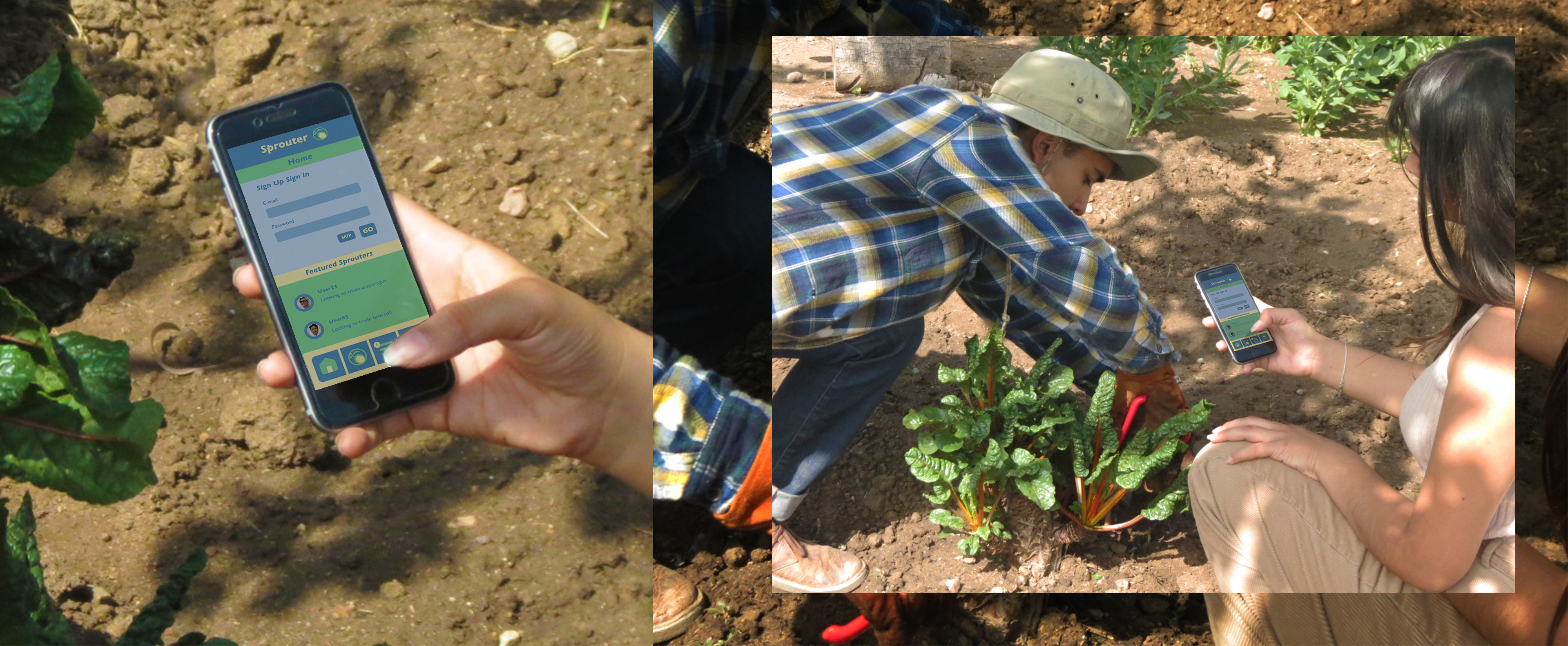 The Sprouter web experience, gives users of all ages, an accessable platform they can use to learn how to grow produce. Speouter can also connect users with others who are available to sell, buy, or trade produce.
My Roles
Brand Strategist, Graphic Designer, Responsive Web Designer
Brand Promise
Inspired by a passion for cooking, interst in local produce, and the urge to connect with others interested in homegrown produce.
Objective
To design a web experience where users of all ages can learn how to grow produce, while having features for users who wish to sell, buy, or trade produce.
Outcome
An easy to use web experience, attracting users who want to learn how to grow produce; and others who want easy access to fresh local produce.
Target Audience
Youth (10-25), Suburban, Urban, Community/Family
Audience Needs
Users need an easy to use web experience, that allows them to get information about growing, selling, buying, or trading produce. Users can access these features without becoming a member.

Challenge
Appealing to a diverse audiece, and satisfying their web experience needs. While encoraging users to continue using Sprouter.
Solution
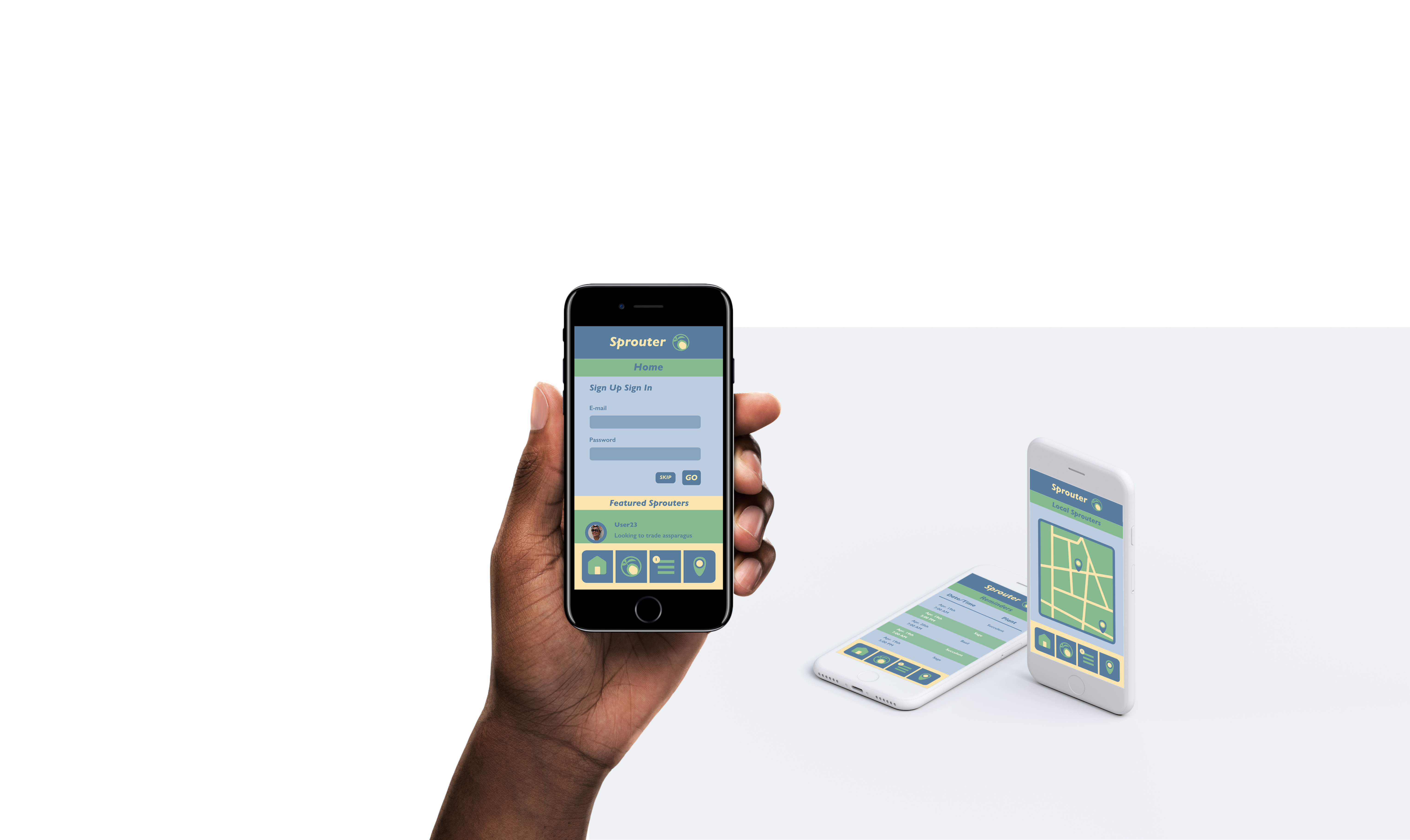
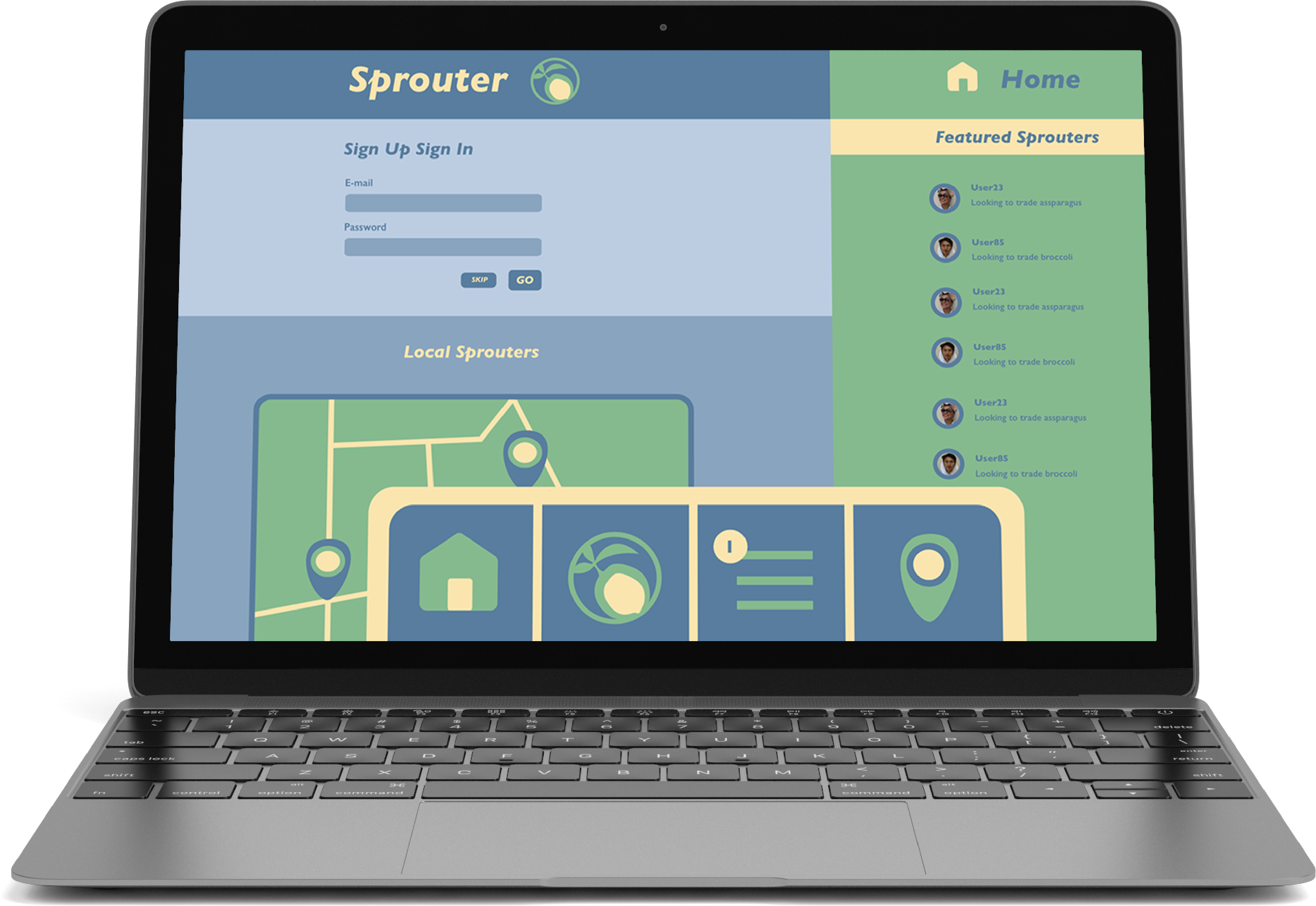
To appeal to a diverse audiece I used a consistent navigation system with four main options. This allows both novice and tech savy users to easily navigate through Sprouter. The opportunities to connect with other local users, and the ability to learn to grow and trade produce as a guest; encourage both frequent and irregular users to continue using Sprouter.
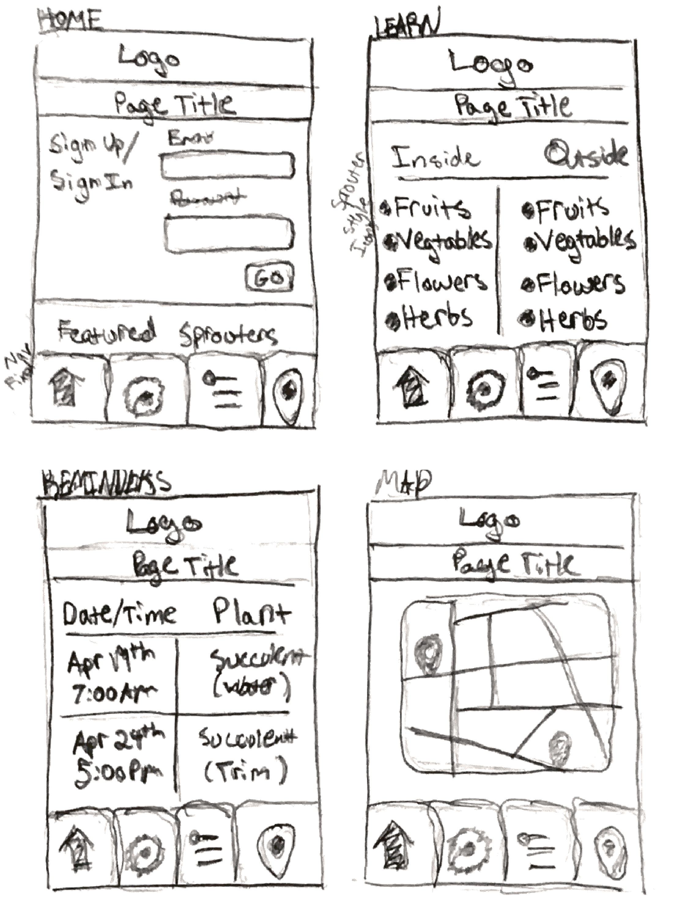
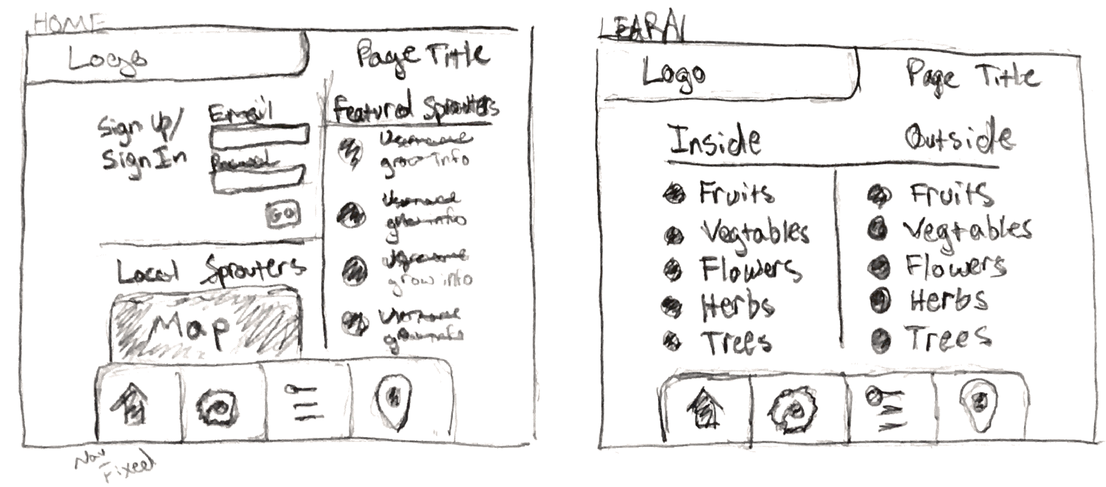
Initial Sketches

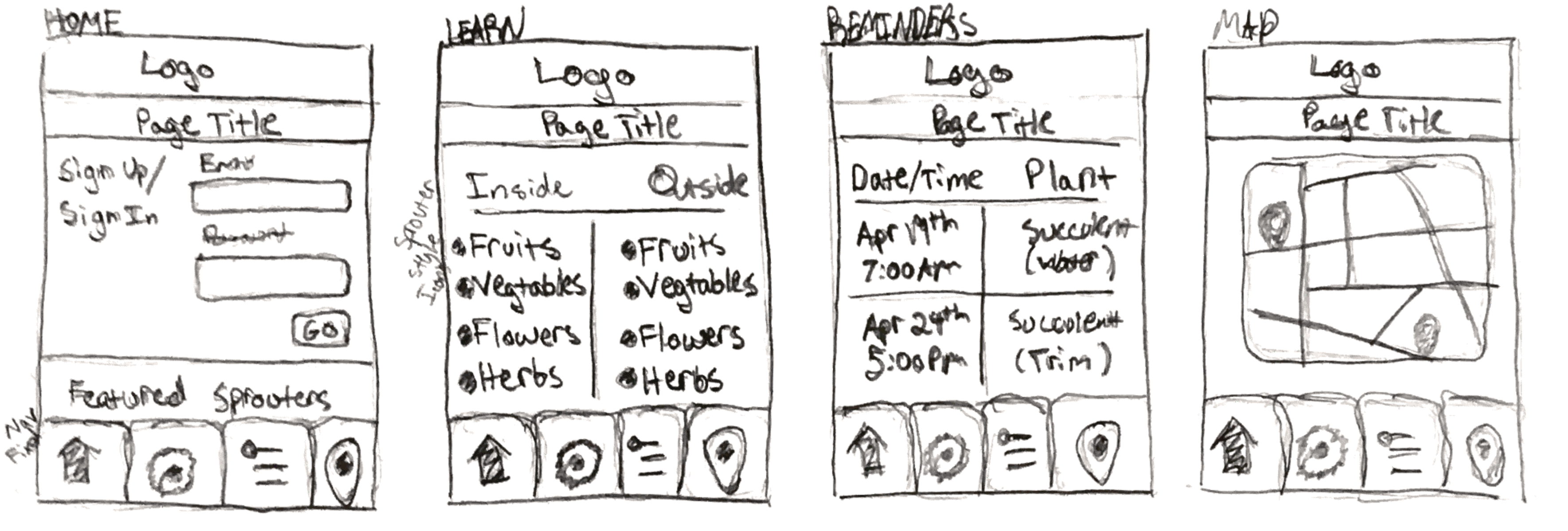
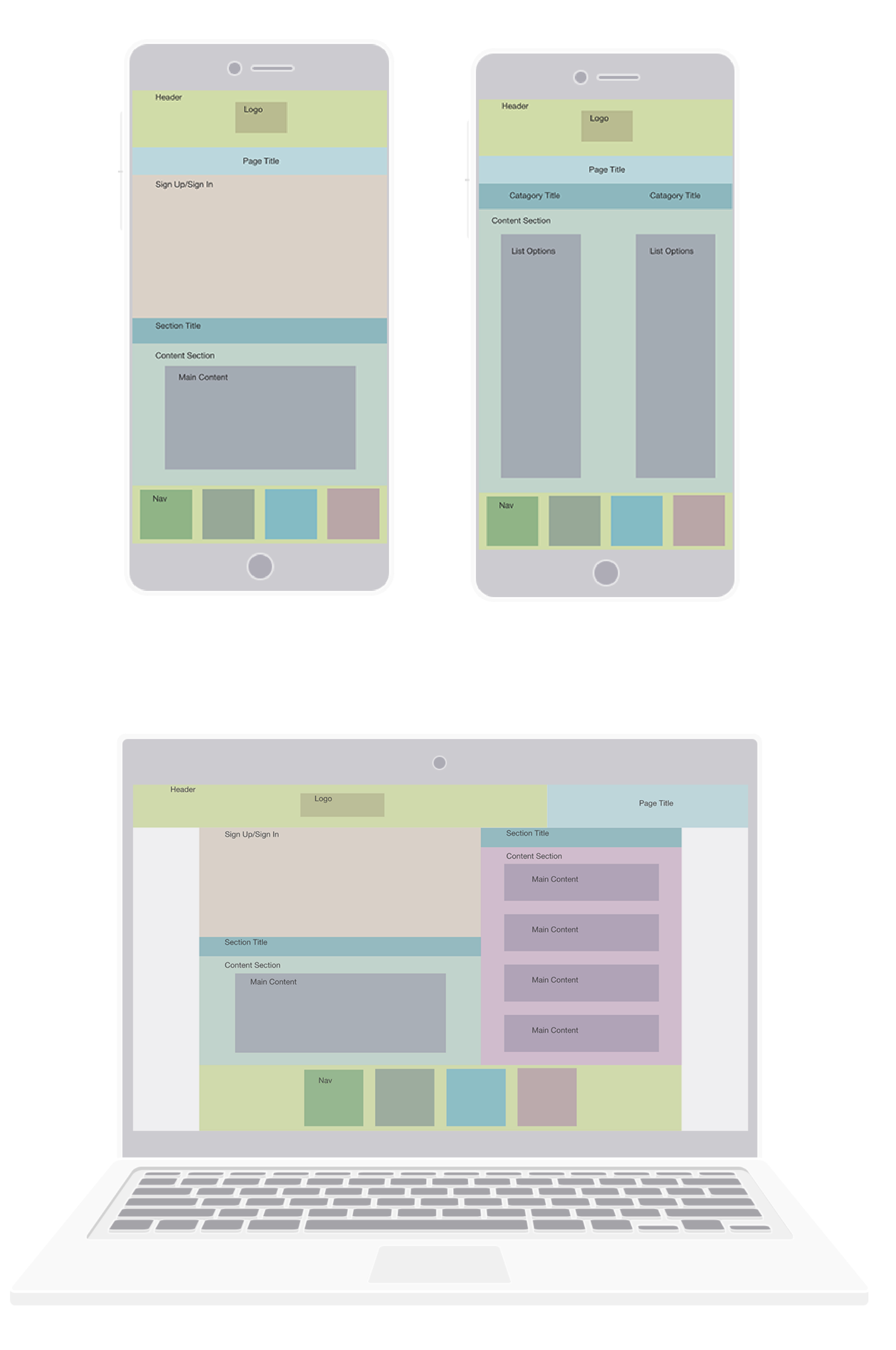
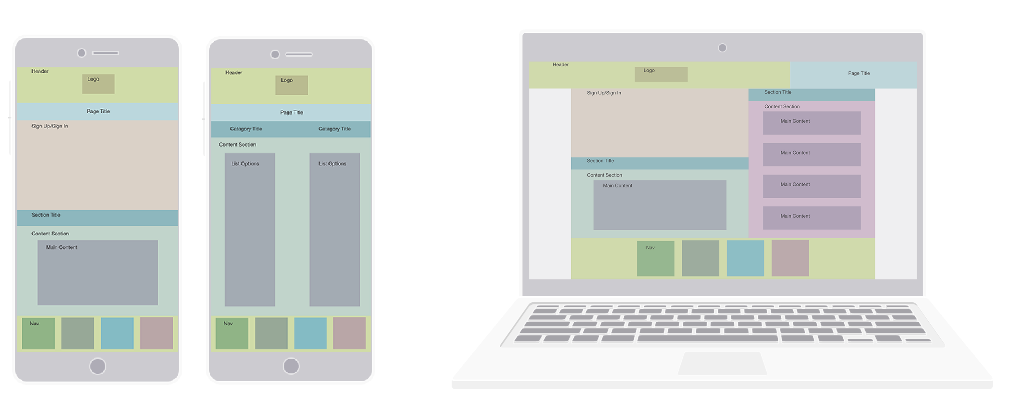
Wireframes
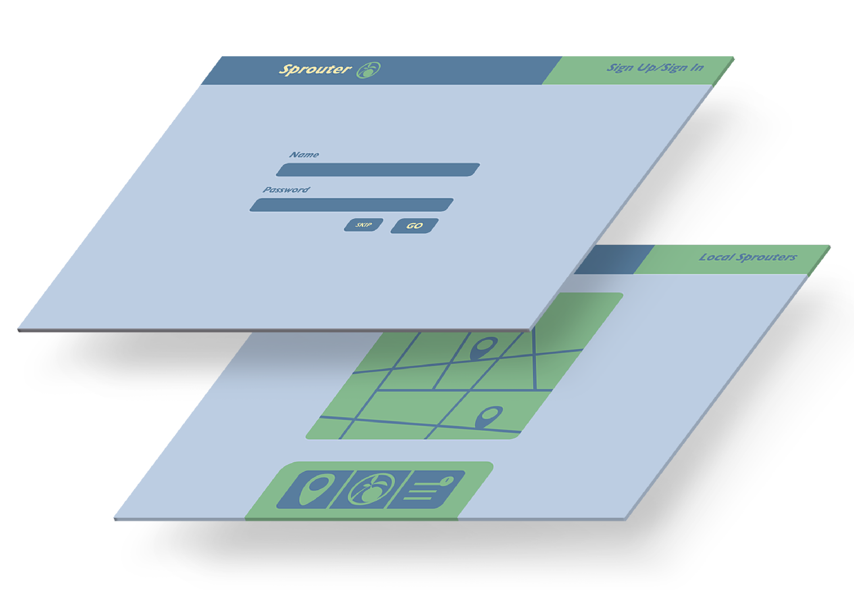
 Design Process
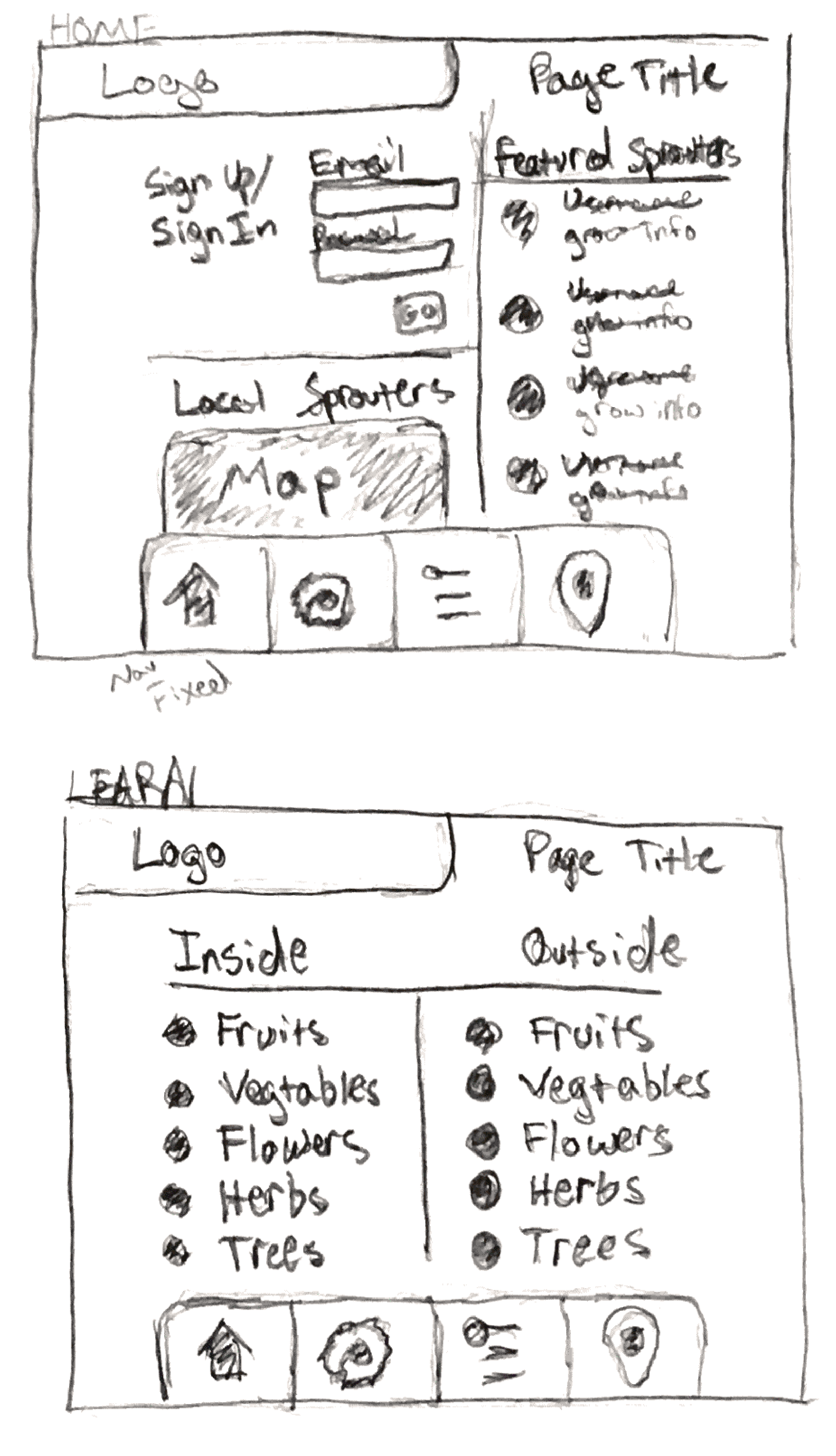
In my initial sketches and wireframes, I focusesd on keeping the page presentation and navigation consistent. This allows both younger and older users can easily navigate the webpage across devices. I kept a fixed bottom menu and used the top area for the logo and page title. Users can use the bottom menu to navigate through all of Sprouter’s main features. This menu allows easy navigation for both novice, and tech savy users.
Design Process
In my initial sketches and wireframes, I focusesd on keeping the page presentation and navigation consistent. This allows both younger and older users can easily navigate the webpage across devices. I kept a fixed bottom menu and used the top area for the logo and page title. Users can use the bottom menu to navigate through all of Sprouter’s main features. This menu allows easy navigation for both novice, and tech savy users.
The initial sketches above, are detailed because my earlier sketches were lacking defined content areas. So I added the details to make sure each section would fit the content meant to be inside. However, when I designed the wireframes, I left out extra details. So, I could focus on the heiarchy and composition of the content areas.
Prototypes & Story
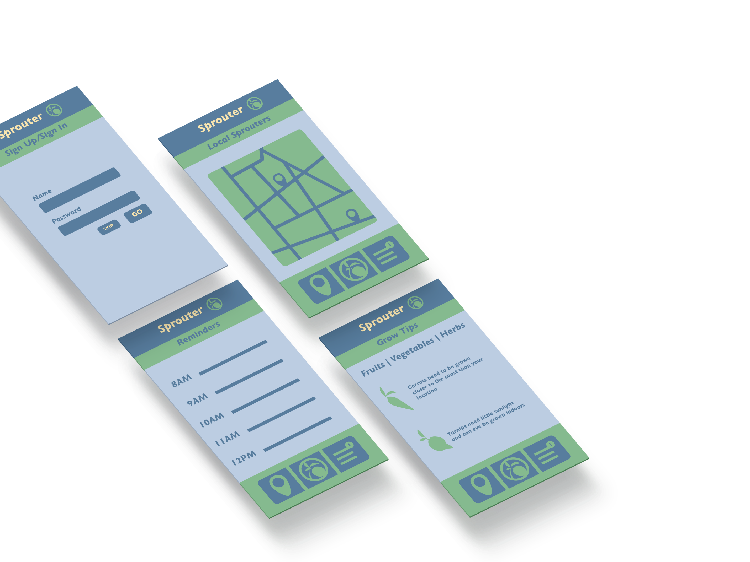
My explorations in the web experience helped me develop Sprouter’s branding further. As I was making wireframes, I worked with the color scheme of the brand. Adding a third color, to the two color scheme I had been using, allowed me to layer elments more cohesively. The upsated compositions have distint sections for the different content areas. Continuing to experiment with the branding and web experience allowed them to develop together.
Final Deliverables