Remember This Branding

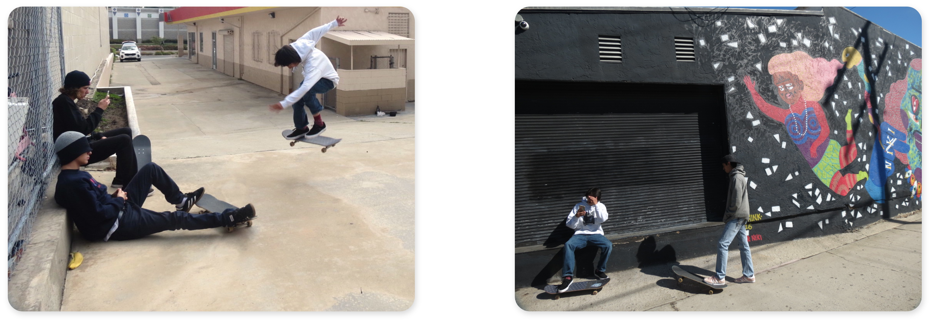
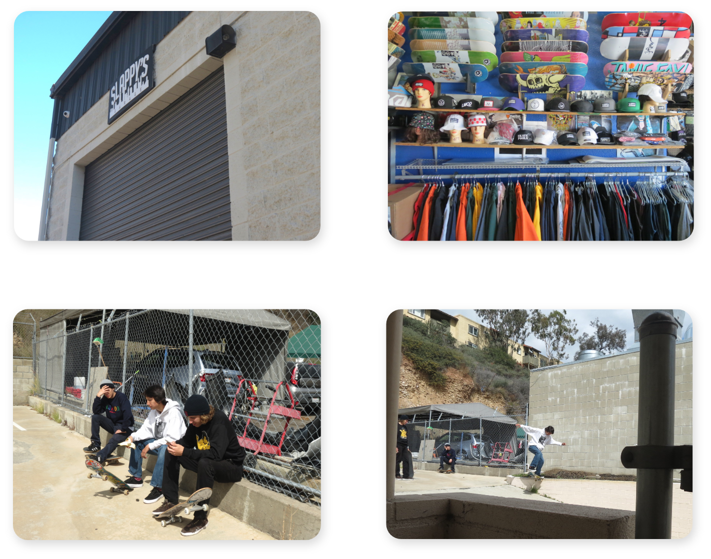
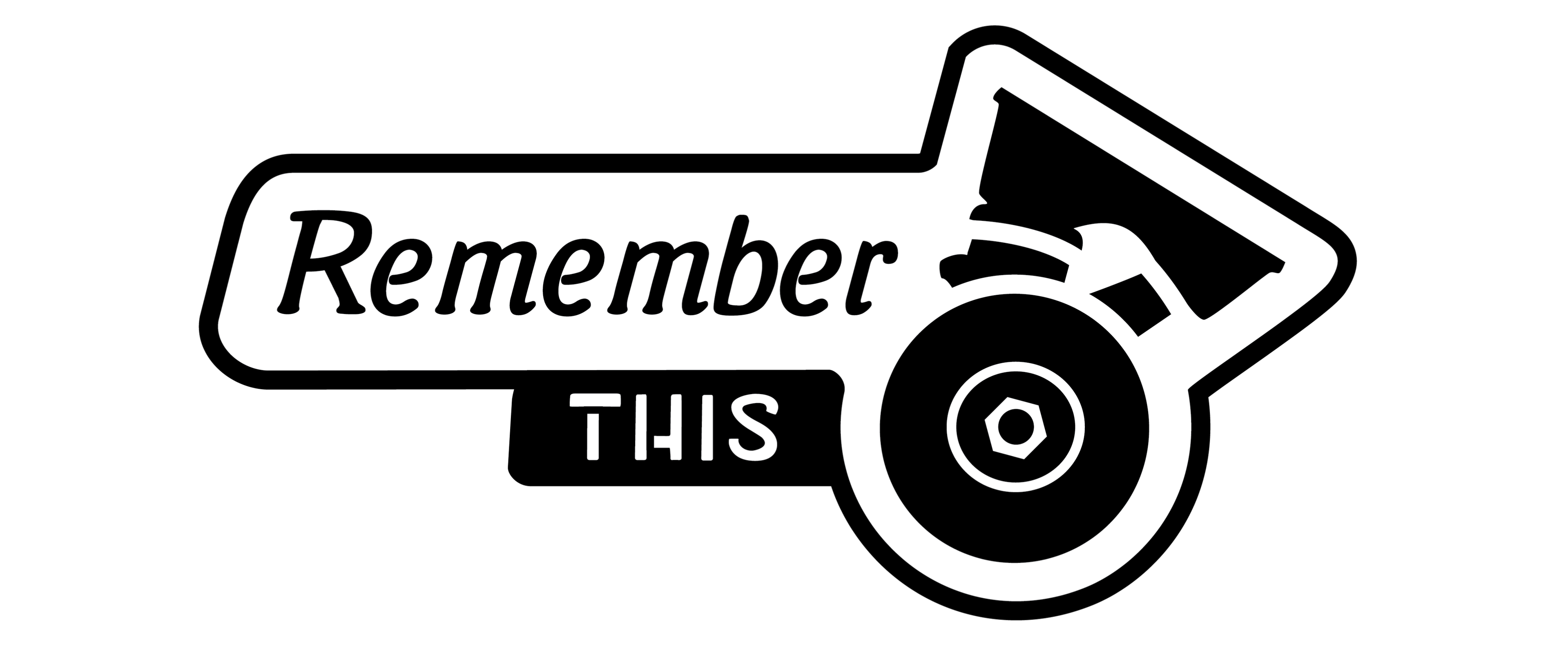 The graphics designed for the Remember This film use a style inspired from the original Slappy’s Garage logo. They illustrate the personal experience of each skateboarder in the film.
My Roles
Brand Strategist, Graphic Designer, Font Designer
Brand Promise
The graphics in Remeber This are skateboarder designed, and authentically convey the experiences of the skateboarders who support Slappy’s Garage.
Objective
To design title graphics that visually represent Slappy’s Garage, and the skateboarders featured in the film.
Outcome
Cohesive introduction, title graphic, and name plates for each skateboarder. Each of these elements representing both Slappy’s Garage and the experience of those involved in the Remeber This film.
Target Audience
Skateboarders, Youth (10-25), California (San Diego), Urban, Community/Family
Audience Needs
Skateboarders want to see the sponsored professionals they admire represented in the Remember This film.
Challenge
Designing deliverables that balance representing Slappy’s Garage, it’s skate team’s authentic skateboarding lifestyle, and their world-class prestige in the skateboarding industry.
Solution
To represent the skate shop, skate team, and their position in the skateboarding industry; I designed a mark made up of simple elements. These elments could be manipulated to look more professional, or casual depending on the situation.
Story
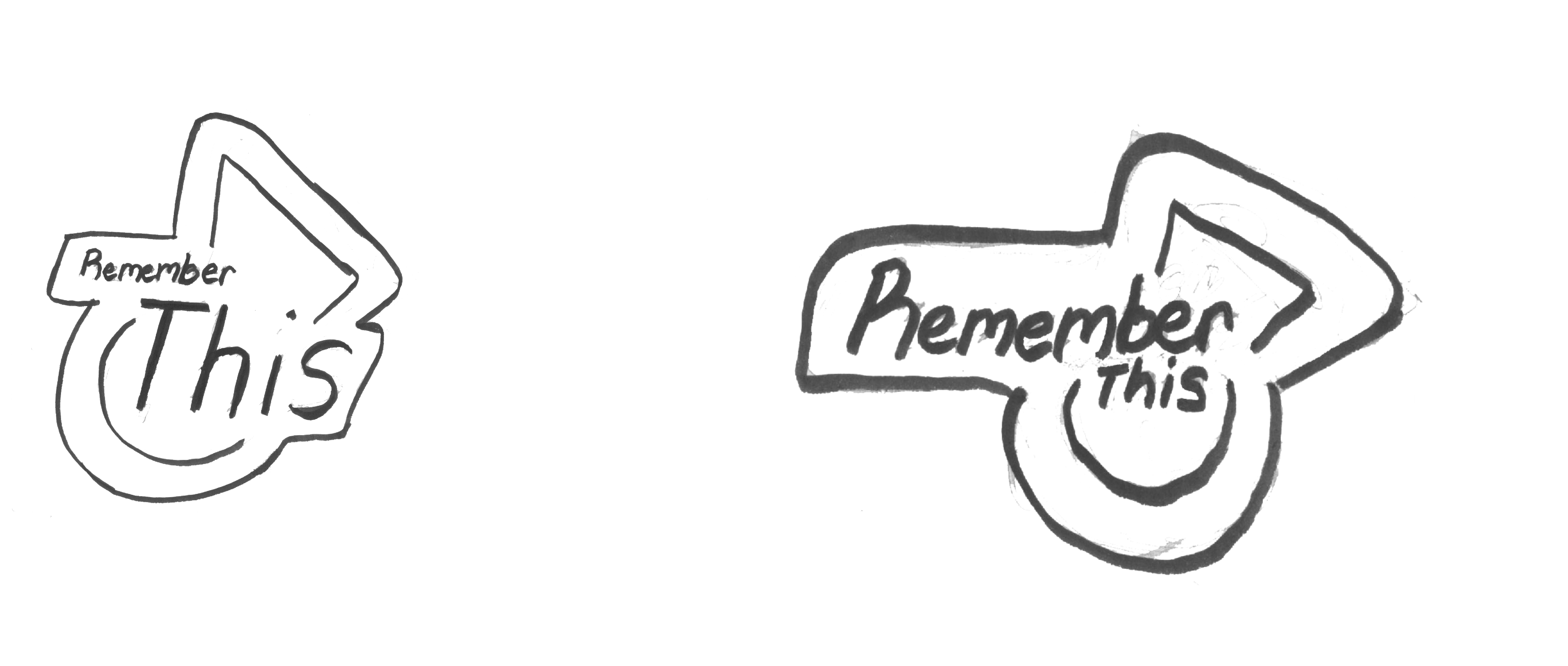
Aside from my personal passion for skateboarding, I chose to do this project because I wanted to collaborate with my friend Daniel Goycooela. I knew that he was filming and editing the Slappy’s Garage film, which didn’t have a title at the time. So I was excited to learn more about what he was doing. I started my process by interviewing Daniel, Jason Carney the shop owner, and a few skateboarders in the video. I asked each of them how they felt about the video, and we discussed their answers together to create a description of the video’s aesthetic. Afterwards, I did some more research on Slappy's Garage, and how it was started. This give me more background information. During this time Daniel, Jason, and the skateboarders in the film decided the title was going to be Remember This. I then used the interview and research to inform sketches, and quick prototypes of the title mark. I presented these to Daniel, and a few of my peers. Then I noted their feedback, and continued to quickly prototype.
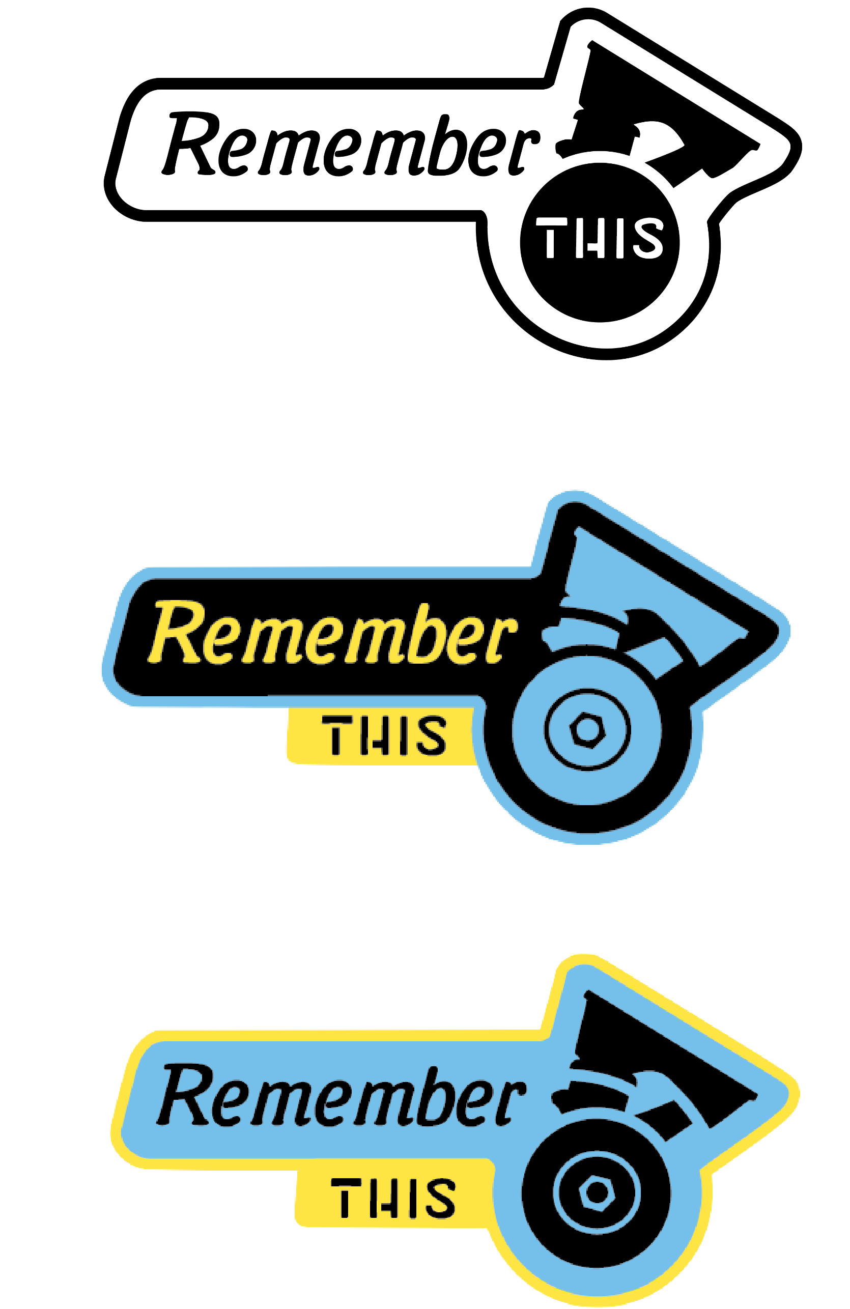
Original Mark
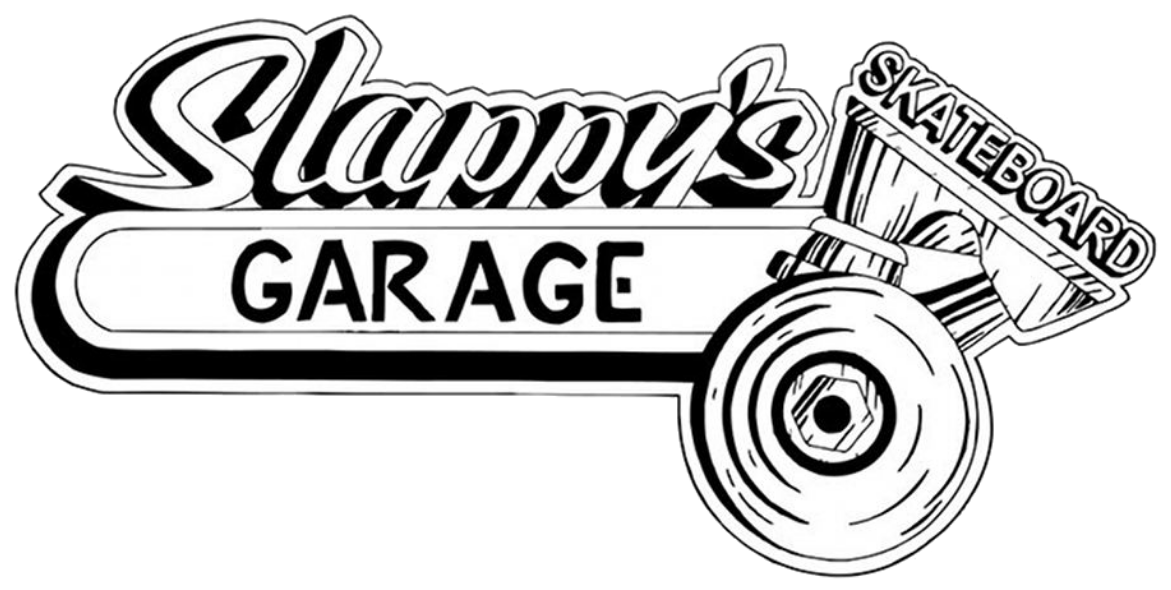
Through my research, I learned that Jason, (the owner of Slappy’s Garage) enjoys working on and restoring old cars. When I learned this, I saw how the shop’s main logo is influenced by old style auto garage culture. Knowing the story of the mark, and understanding where the style comes from, were very important to moving forward with the branding. The style and composition of this mark, are my biggest influence in my title graphic designs.
Sketches

Mark Iterations

Design Process
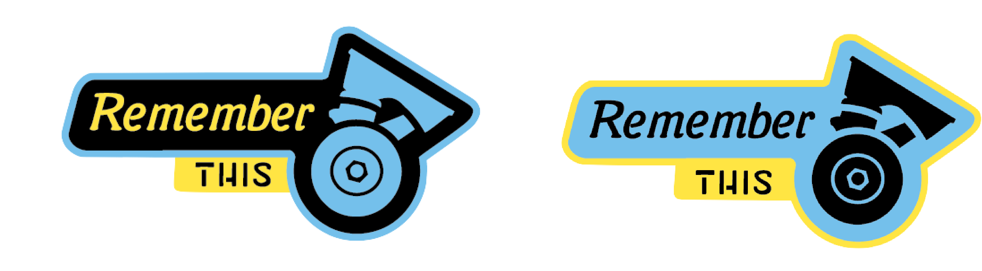
I started my work by doing research on local (San Diego) skate brands. I observed how each brand expanded their branding into different touchpoints. Most local brands I ecountered, were using monochrome color palettes, and simple shapes to build their marksS. Many skateboarding brands use this style, because simple shapes, and monochrome schemes can be manipulated to represent the wide variety of lifestyles in the community. In the iterations above, I wanted to keep the mark design and branding consistent with the industry; while specifically representing Slappy’s old style aesthetic. I chose bold elements to increase impact of the mark, while using the style of the original logo, to keep brand equity.
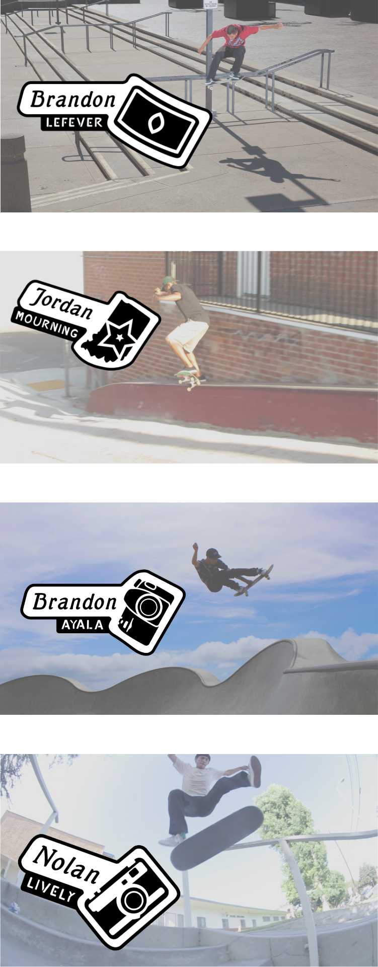
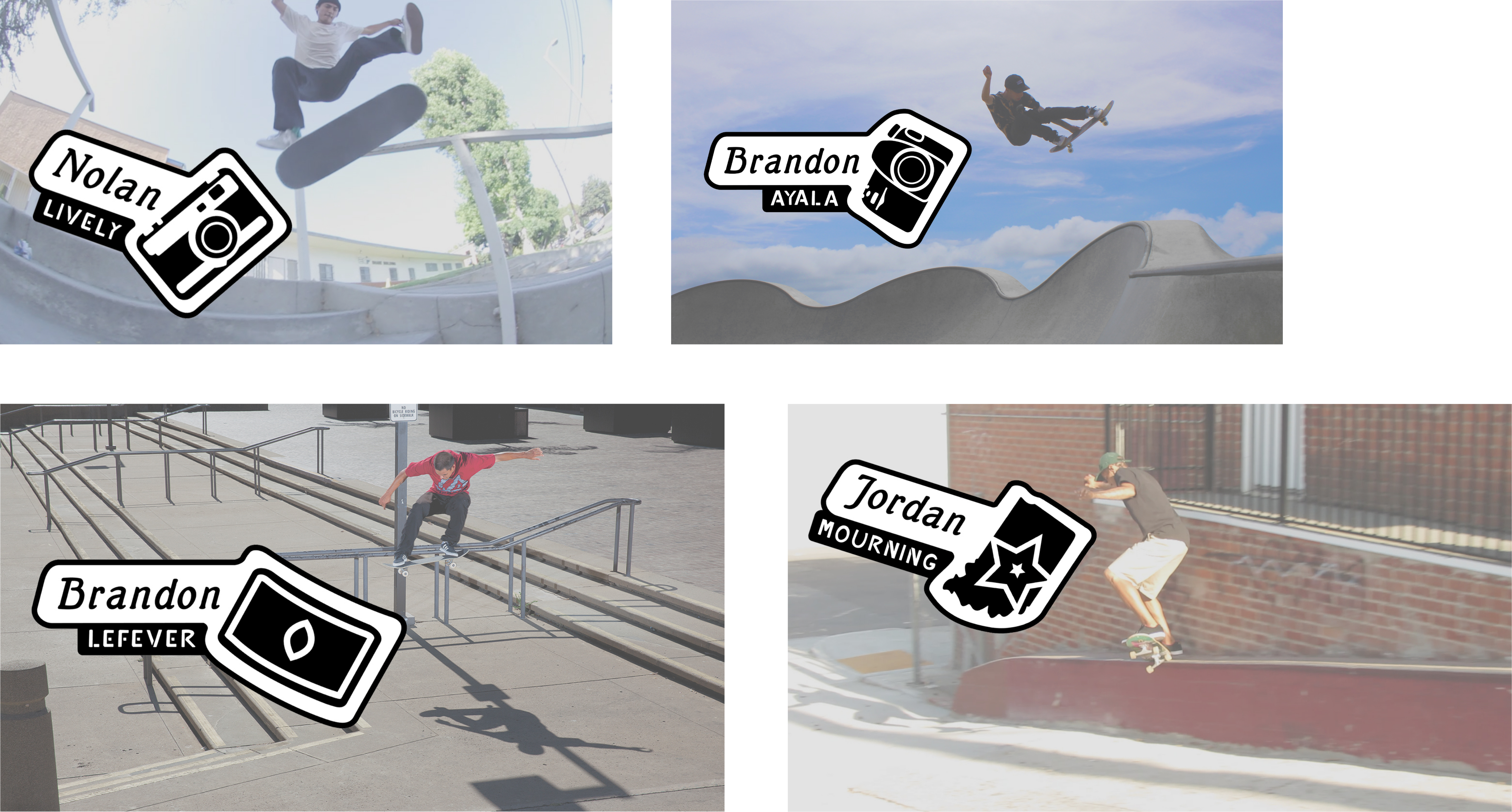
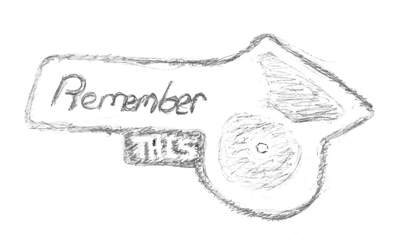
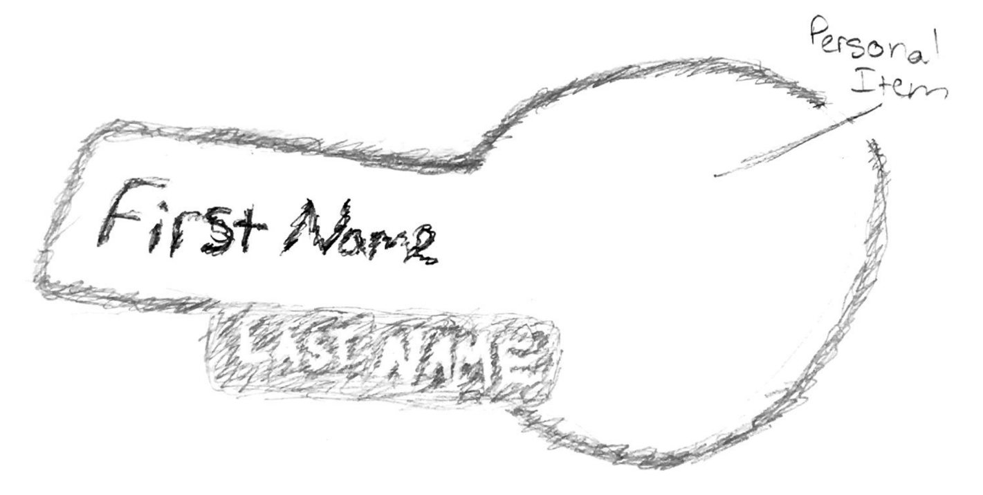
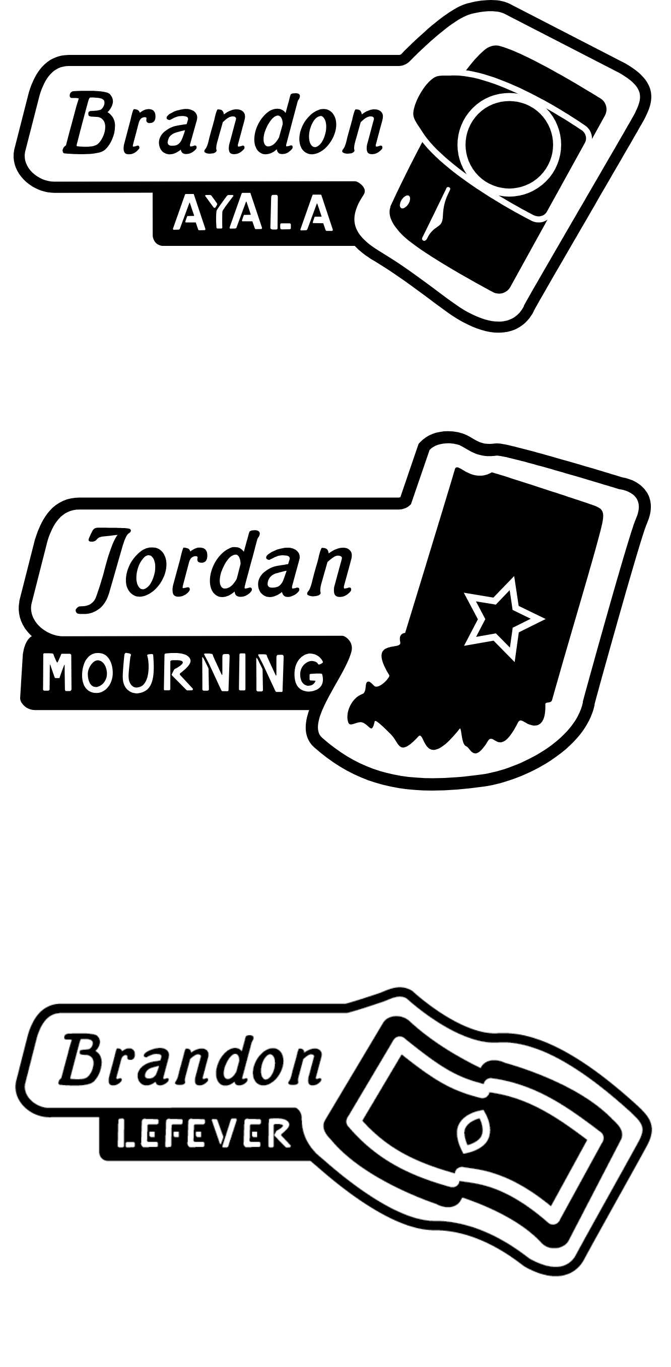
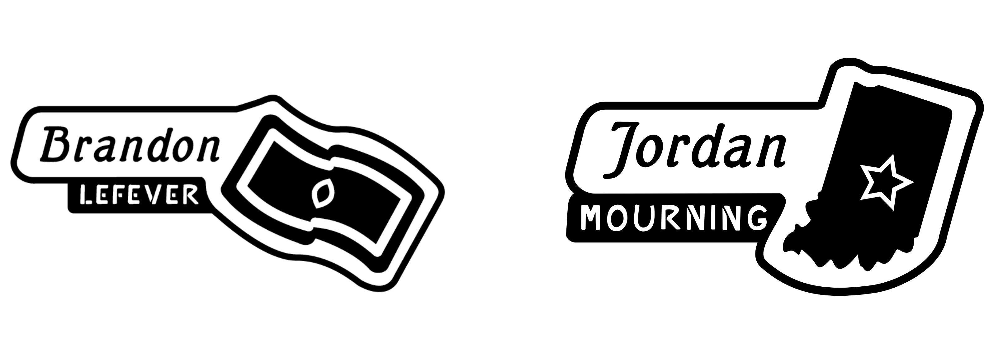
After receiving feedback on these prototypes from my peers and skateboarders in the video, I continued to refine the mark. Despite the conclusion from my research; I experimented with a two color scheme suggested by the filmer and editor Danny Goycooela. These experiments revealed how the black and white mark is more flexible for collateral branding. At this point in my process, I realized that I needed to make a system of marks. Each mark influenced by the style of the emblem designed. Each team rider with a large section in the film has their own title, featuring a simple illustration of something personal to them.
Fonts


Both of these fonts are meant to be an updated version of the fonts in the original logo. The first font, Mutter Krause Halbfett, is an old style serif font that matches the original Slappy's Garage logo. It's subtle thick thin stroke and slanted axis are the reason it matches so well. I also removed serifs at the top, to make the font similar to the original logo, and maintain brand equity.

The font, Garage Sans, I created myself specifically for this project. It's directly copied from the style from the origonal mark's font. This keeps the contrast between the larger italic font, and simple stencil font that the original logo has.
Branding System Prototypes
Final Deliverables