Inframe Branding

 Inframe is a marketplace for a people who want to purchase products personalized by artists, subjects of artworks, and through collaborations.
My Roles
Brand Strategist, Graphic Designer, Responsive Website Designer
Brand Promise
Inspired by my love for art; and the intention to generate income collaborating with peers across different mediums.
Objective
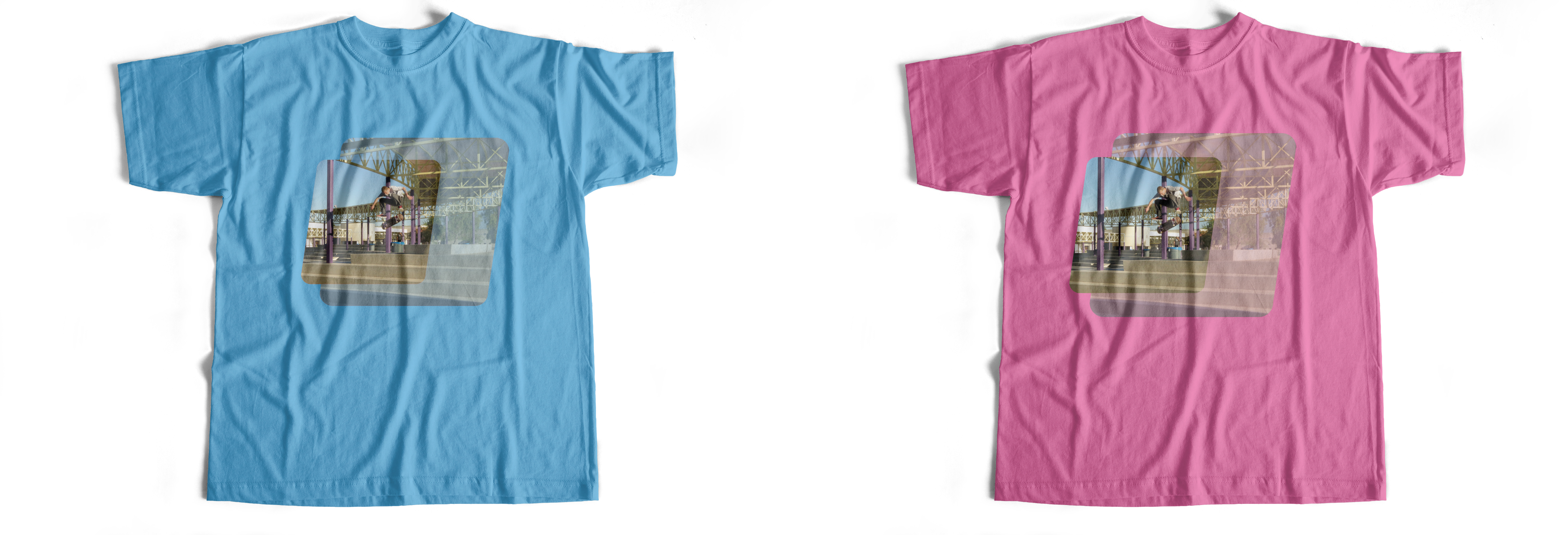
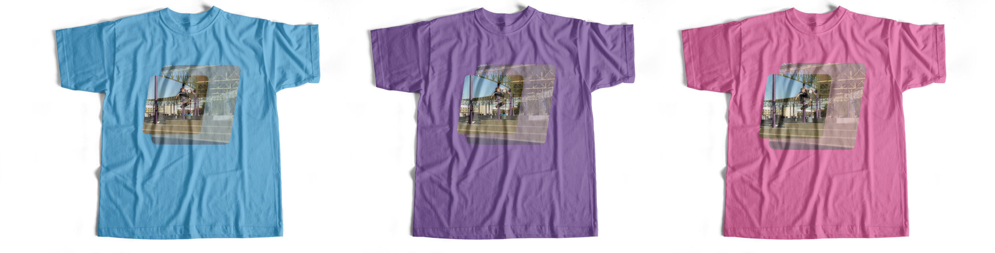
To design flexible branding for an online marketplace. Where artists, subjects, and other collaborators can sell products that feature their art to users.
Outcome
The brand is flexible enough to represent any genre, or medium of art. The brand connects a global community of artists, subjects, and users, to facilitate new collaborations.
Target Audience
Artists, Public Figures, Mid-High Income, Urban
Audience Needs
Users are seeking products personalized by a known public figure; or product that features artwork from a specific artist.
Challenge
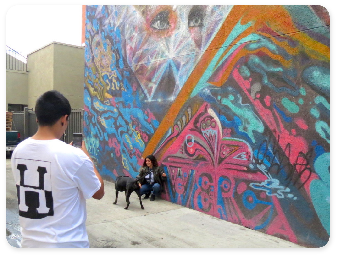
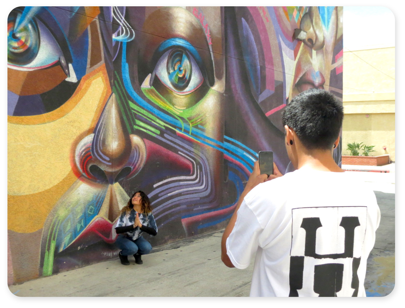
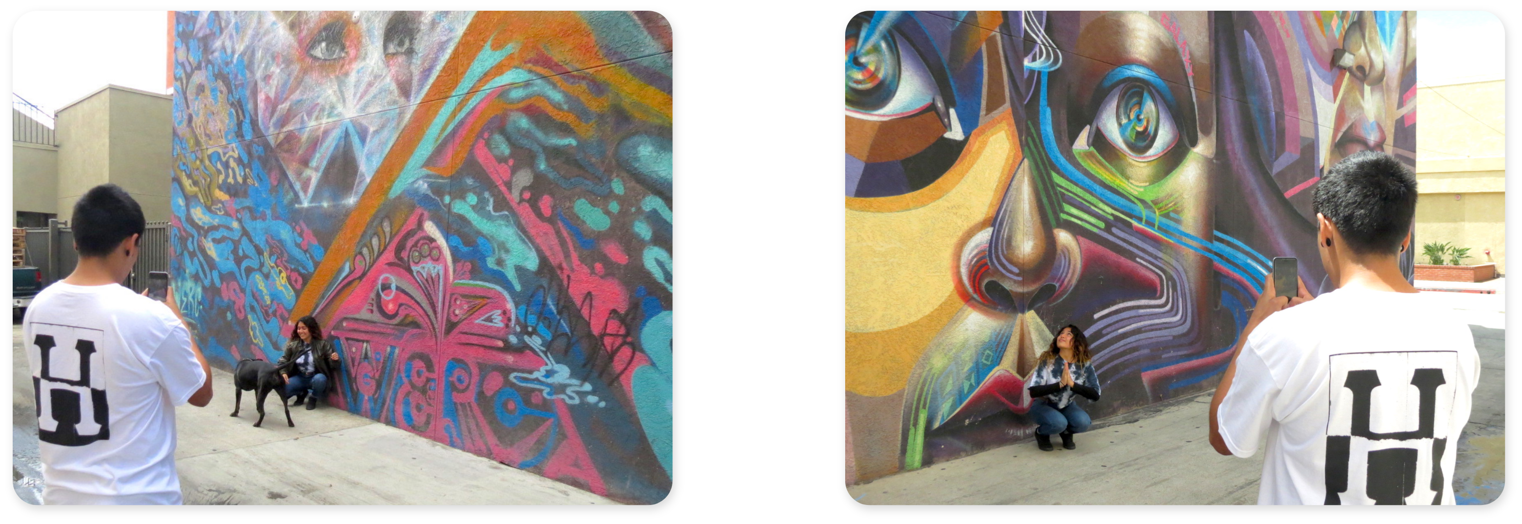
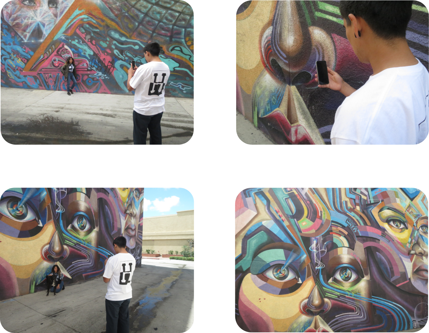
Finding a way to illustrate the variety of people who make up Inframe's collaborative community.
Solution
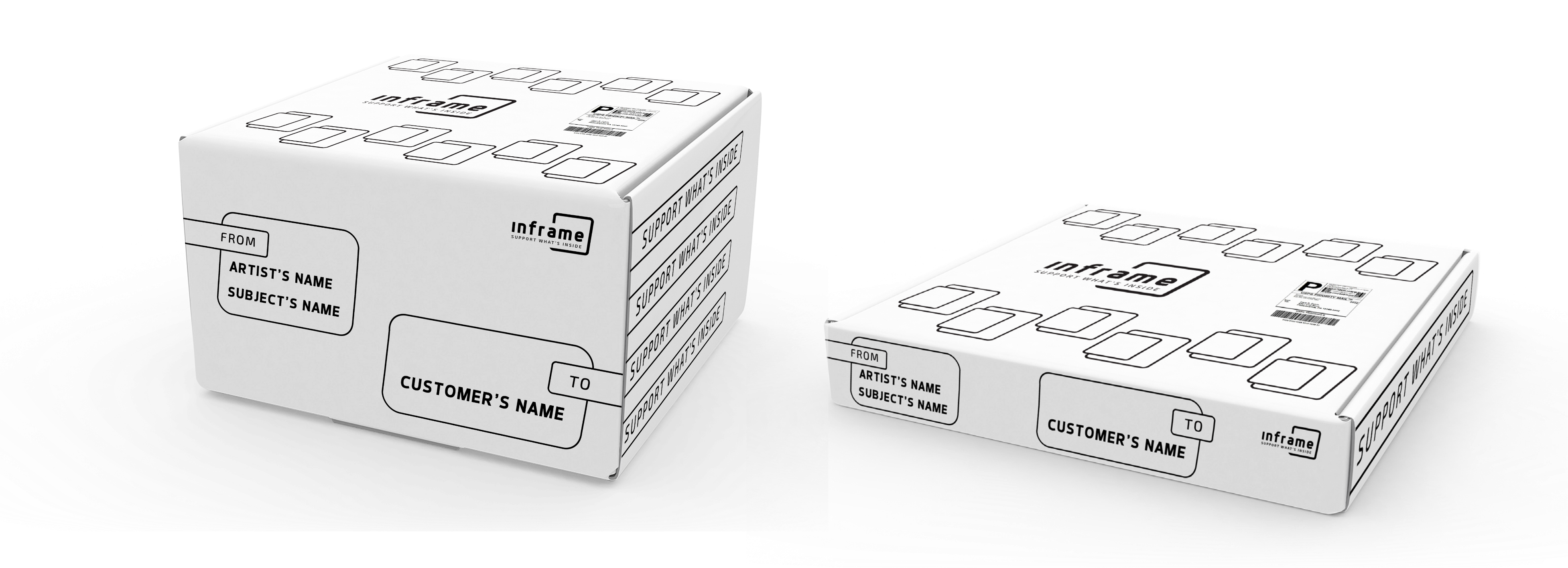
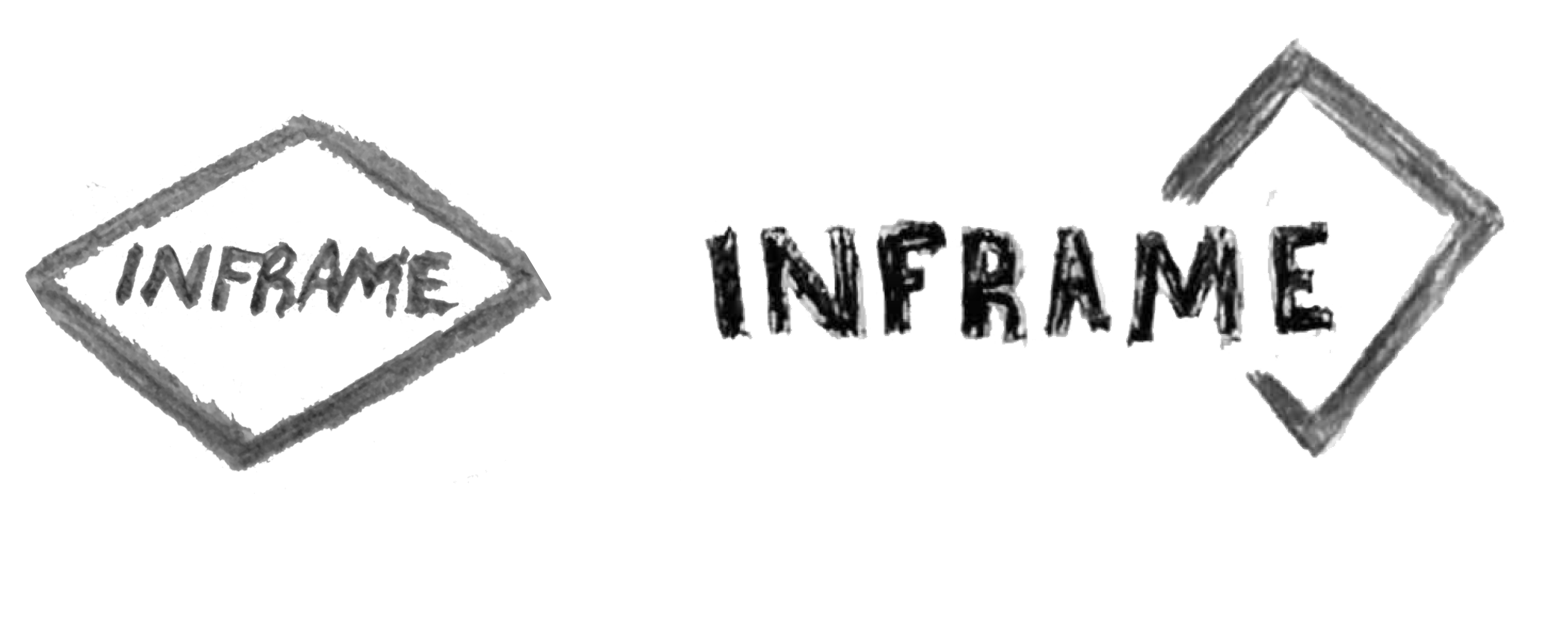
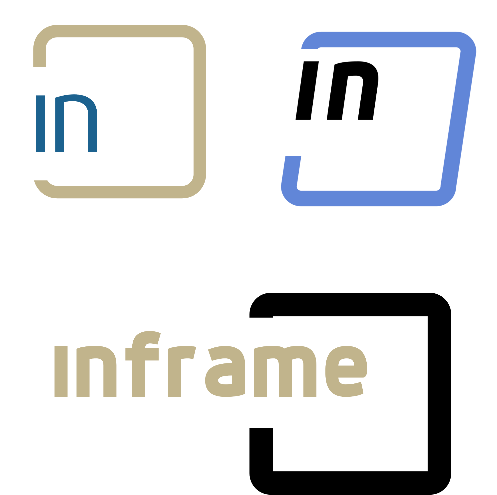
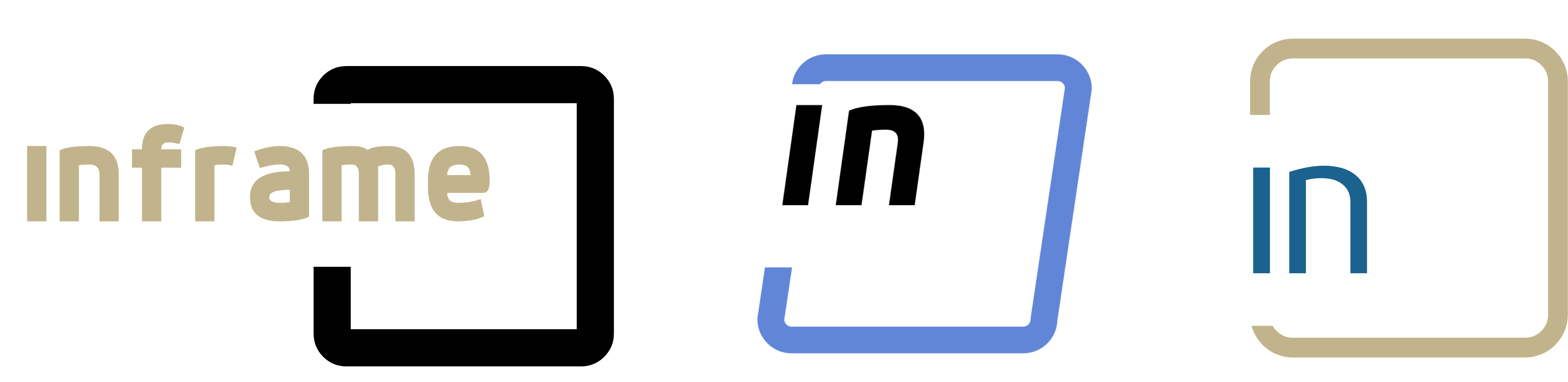
To illustrate the variety of people apart of the brand; I designed a mark with a few simple elements. Each element represents a different part of the collaborative community that makes up the brand.
Story
I was inspired to create this project because I see a need for artist to be able to collaborate with subjects who have large followings, and vice versa. I also see a need for people to support with public figures they follow. To satisfy these needs I created a brand that provides direct support to an innovative community of artists, and subjects.
Sketches

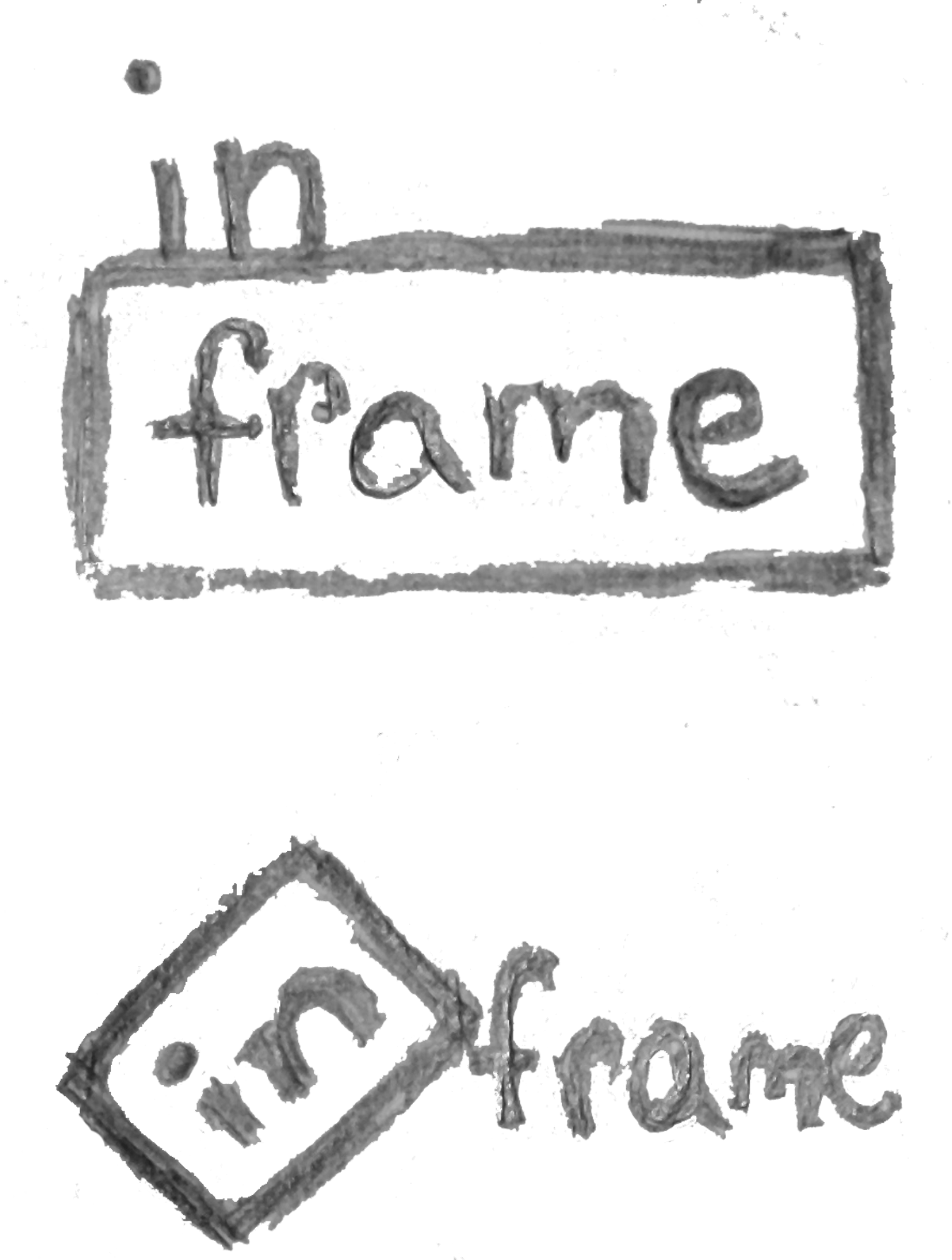
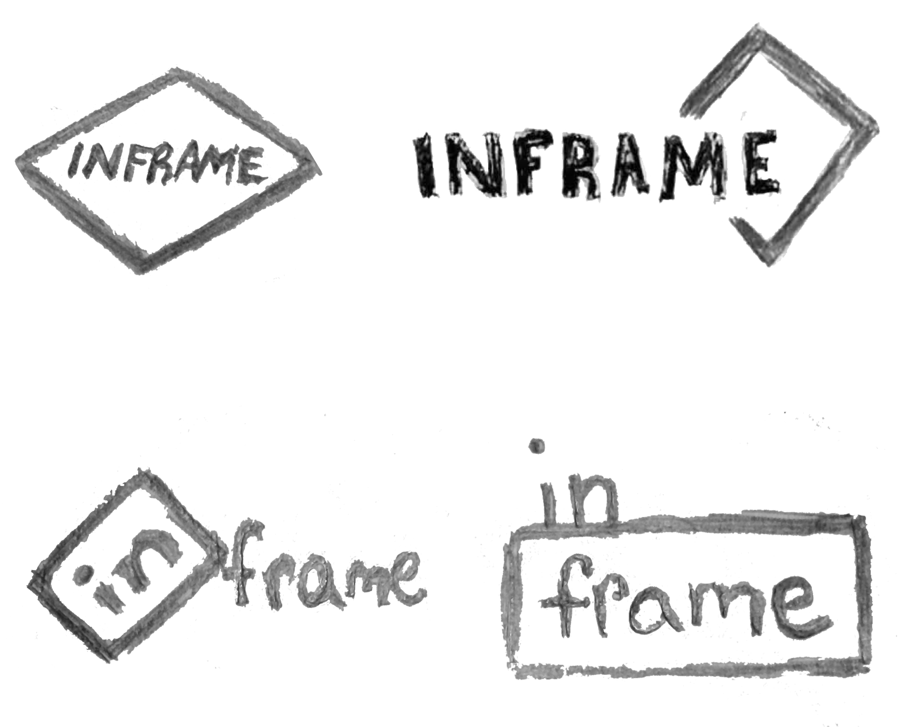
Mark Iterations
Design Process
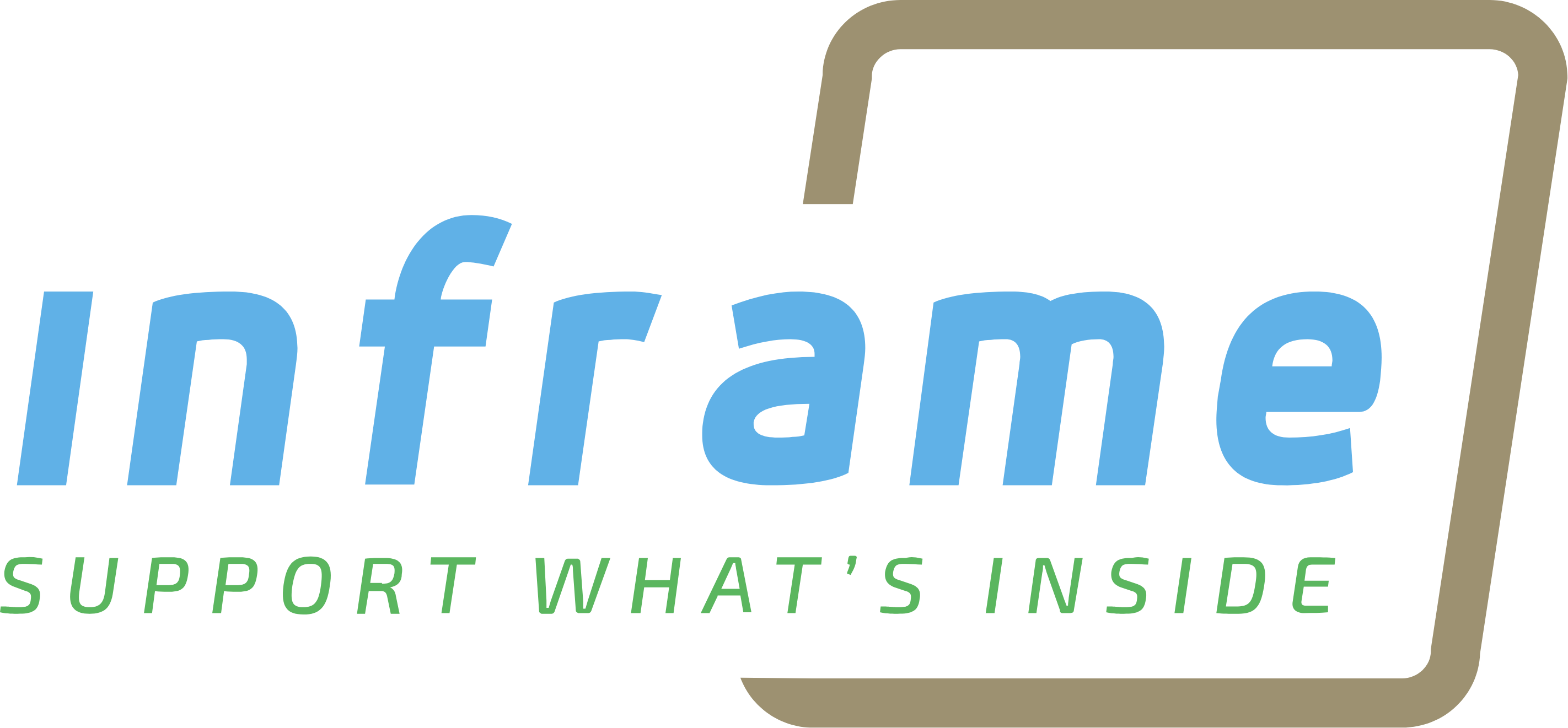
I started this project with the idea of collaboration and a few sketches incorporating slants. This developed into using an italic font, and a slanted box in the mark. The name, Inframe, was chosen from a group of names I brainstormed; it highlights the collaboration between the artist and the subject. The tagline, “support what’s inside,” represents the artists supporting the subjects with artistic representaion. It also invites users to support the artwork. I proceeded to sketch and develop the mark and used a slanted box to literally represent the frame and match with the italic text.
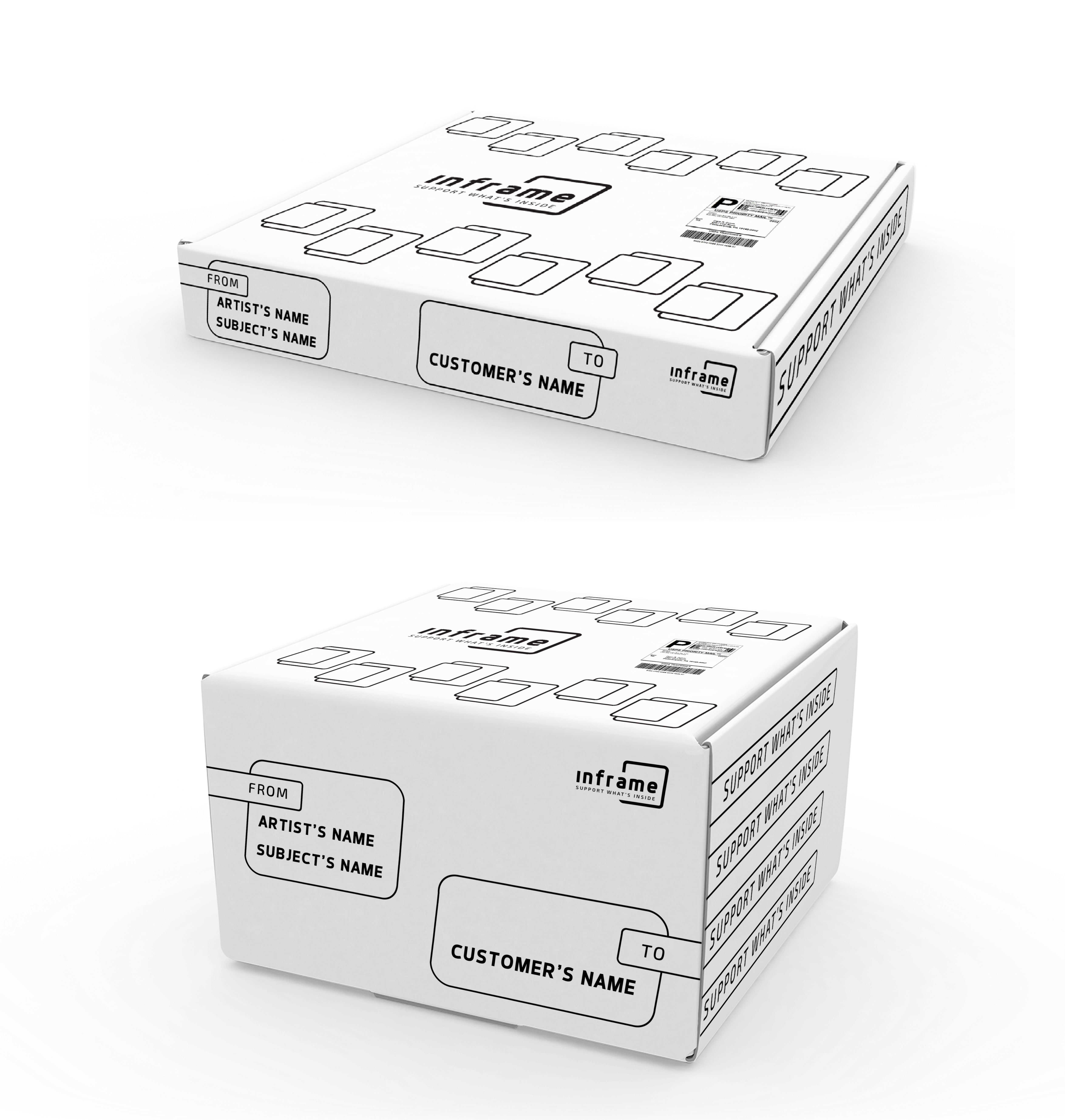
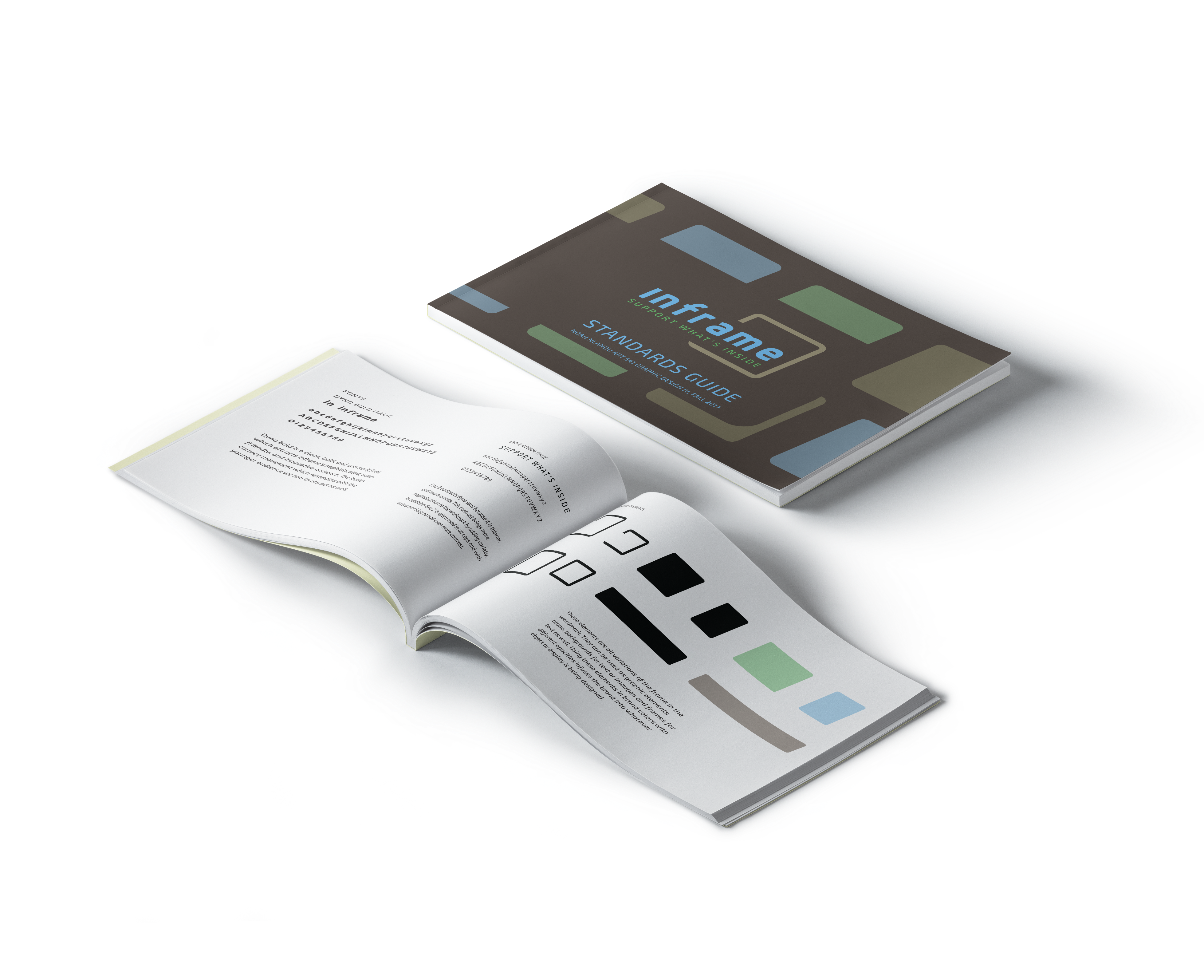
I designed protoypes of the stationary using early versions of the mark, while I continued refining it. With the mark and stationary complete I wireframed the web pages. I experimented with the brands colors as well during this time. I chose a four color scheme to improve the contrast of different elements in the logo and in my layouts. Then I finished refining the web pages and designed a style guide using the elements from the stationary and web collateral.
Fonts & Color


Dyno bold is a clean, bold, san serif font. I chose Dyno because it attracts Inframe’s sophisticated, friendly, and innovative audience. The italics convey movement which resonates with the younger audience Inframe aims to attract as well.

Exo 2 contrasts Dyno sans because it is thinner, and more ornate. This contrast brings more sophistication to the wordmark, by adding variety. In addition Exo 2 is often used in all caps and with extra tracking to exaggerate the contrast.

Brown represents the envirornments where artwork is made, and artist subjects live. The tan represents the frame. Light blue represents the subjects, and bright green represents the users.
Final Deliverables