Sprouter Branding

 Sprouter is a brand that connects people who are interested in growing produce, people who already grow, and others looking buy and trade produce in their community.
My Roles
Brand Strategist, Graphic Designer
Brand Promise
The idea for this brand is a result of my passion for cooking, combined with my emerging interest in growing produce.
Objective
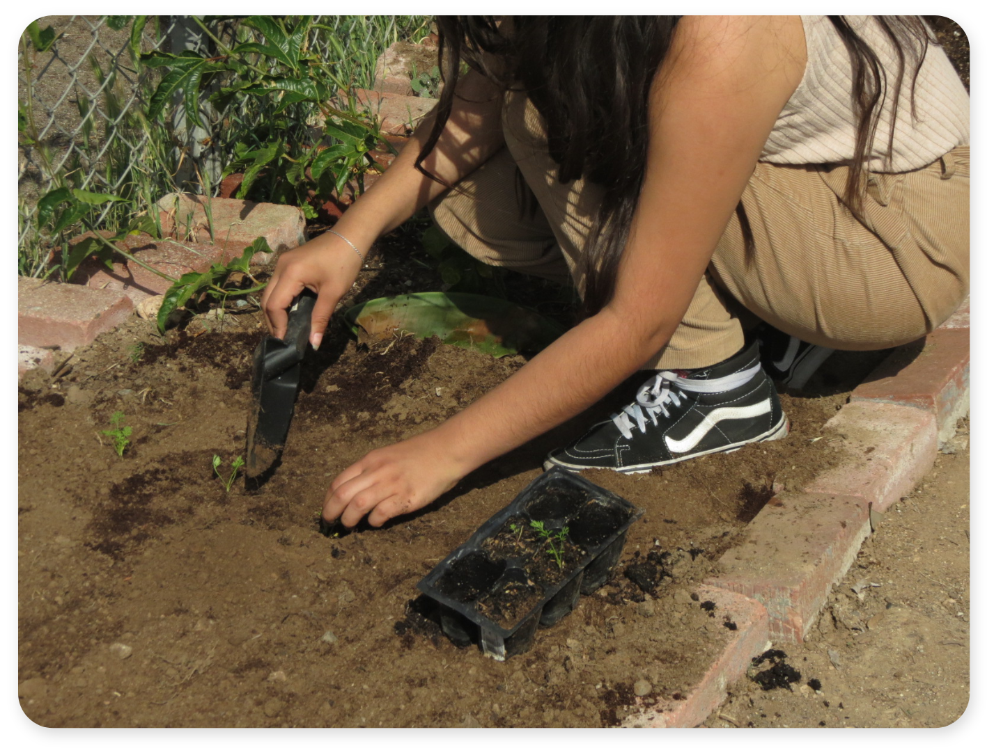
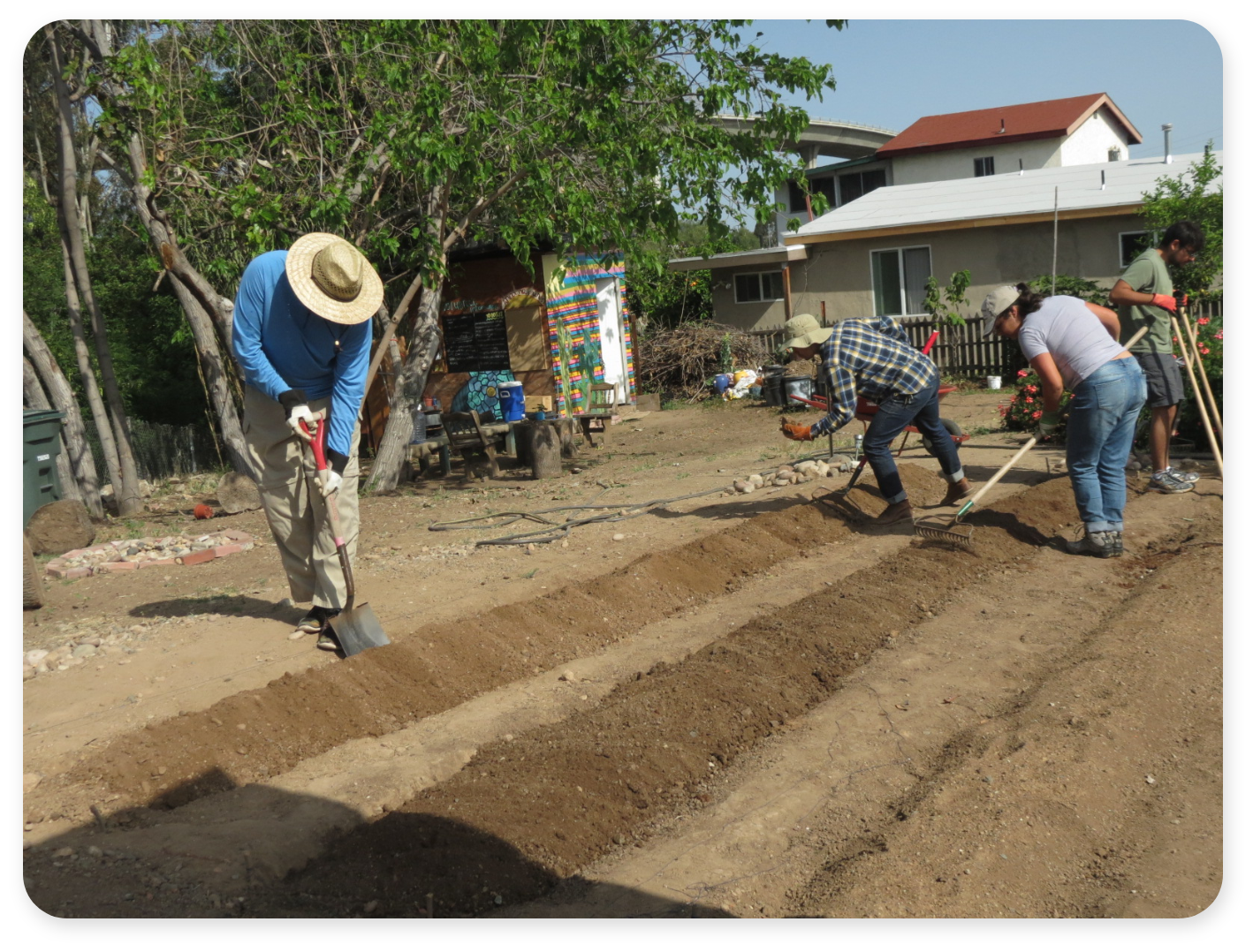
To create a platform where people can learn to grow food in their local area, and connect with other growers as well.
Outcome
A platform that teaches people how to grow produce, and allows them to connect within their local communities.
Target Audience
Youth (10-25), Urban, Community/Family
Audience Needs
Users are interested in growing produce, they want to have fresh food at hand, and also want to connect with other growers.
Challenge
Designing branding that can appeal to children and adults. Sprouter wil also have rewards for users that encorage continued use.
Solution
To appeal to a diverse audience I branded Sprouter using simple icons. This allows people to become famillar with the brand quickly, because the icons' style are distinctly recognizeable. The opportunities to connect with other local users, and the ability to learn to grow, and trade produce as a guest; encourage frequent and irregular users to continue using Sprouter.
Story
When I was younger I always had an interest in growing plants. I loved to watch a seed transform into a full grown plant. However, I've never tried to grow anything myself. Now that I'm older I've actually become vegetarian, and my interest in growing plants increased with my change in lifestyle. The idea behind Sprouter, is to teach users about growing plants in order to capture their attention. Then while they learn to grow they can connect with others who are growing as well. People who’d like to have fresh fruits or vegetables at hand, and others who’d like to invest in homegrown produce in their community, would use Sprouter often. I designed Sprouter to be a digital farmers market.
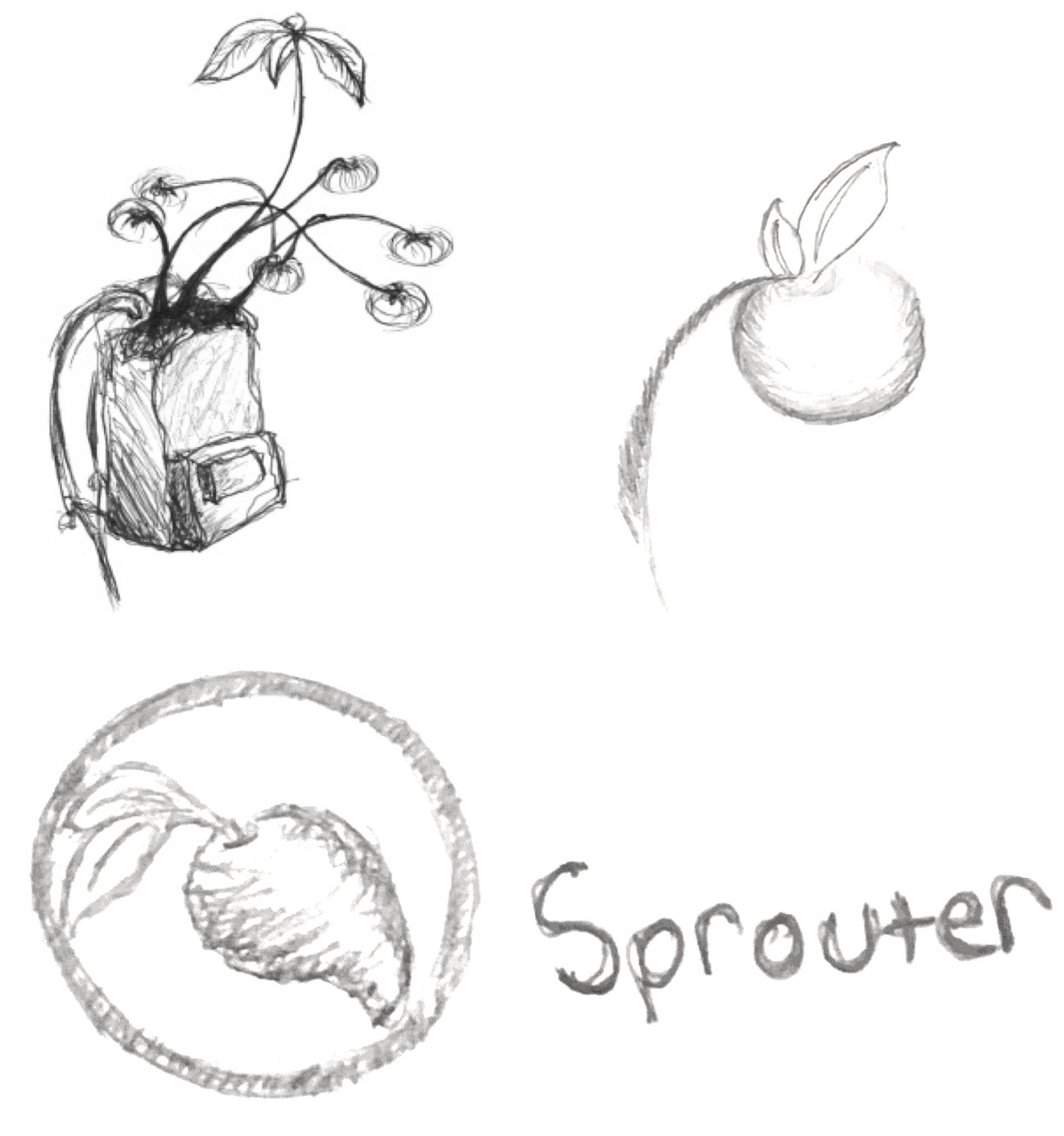
Sketches

Mark Iterations


Design Process
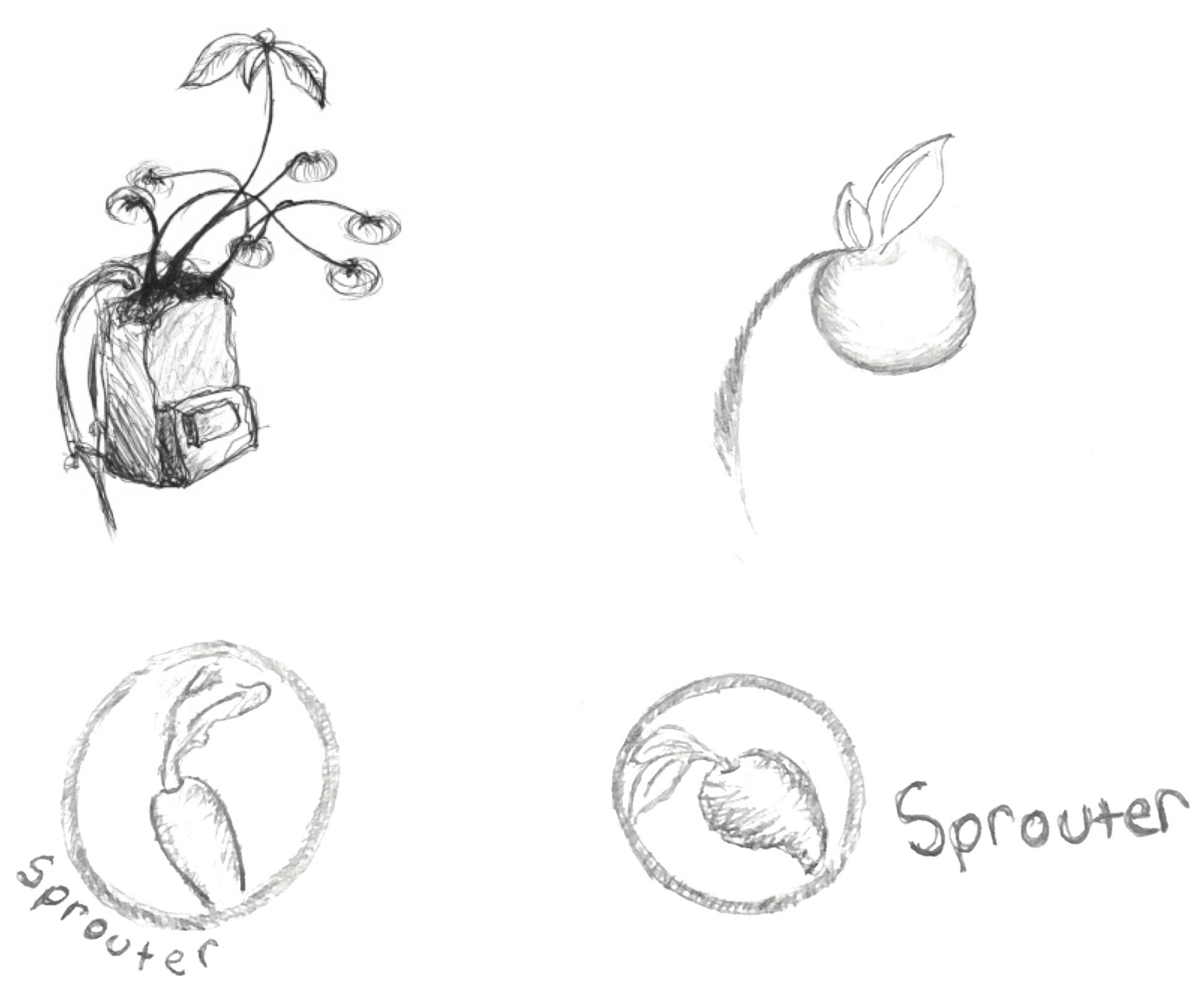
This project started from a sustainability campaign, encouraging children to grow their own produce. The slogan was, “Grow Your Future”, and Sprouter was a promotional tool for the campaign. Sprouter’s name is based on the idea of people learning to grow produce. Users wouldn’t be legitimate farmers while learning, they would be “Sprouters”. I started to design the mark for Sprouter, by isolating the most prominent element from the Grow Your Future campaign mark. The element was fruit hanging from a vine. In the original sketch above, the fruit was growing from inside a backpack. This was to represent how kids can use their own resources to grow their own food.
As I moved forward from the campaign to the brand, I wanted to keep the same values of D.I.Y, and sustainability. However, I also wanted to broaden the appeal to a larger audience, and to make the brand appear trustworthy and knowledgable.
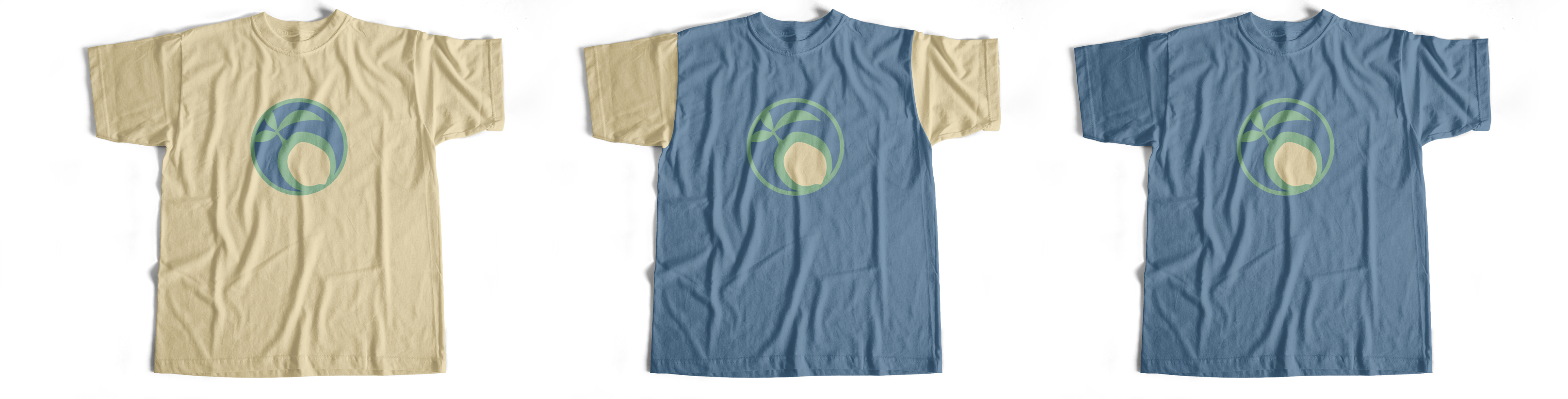
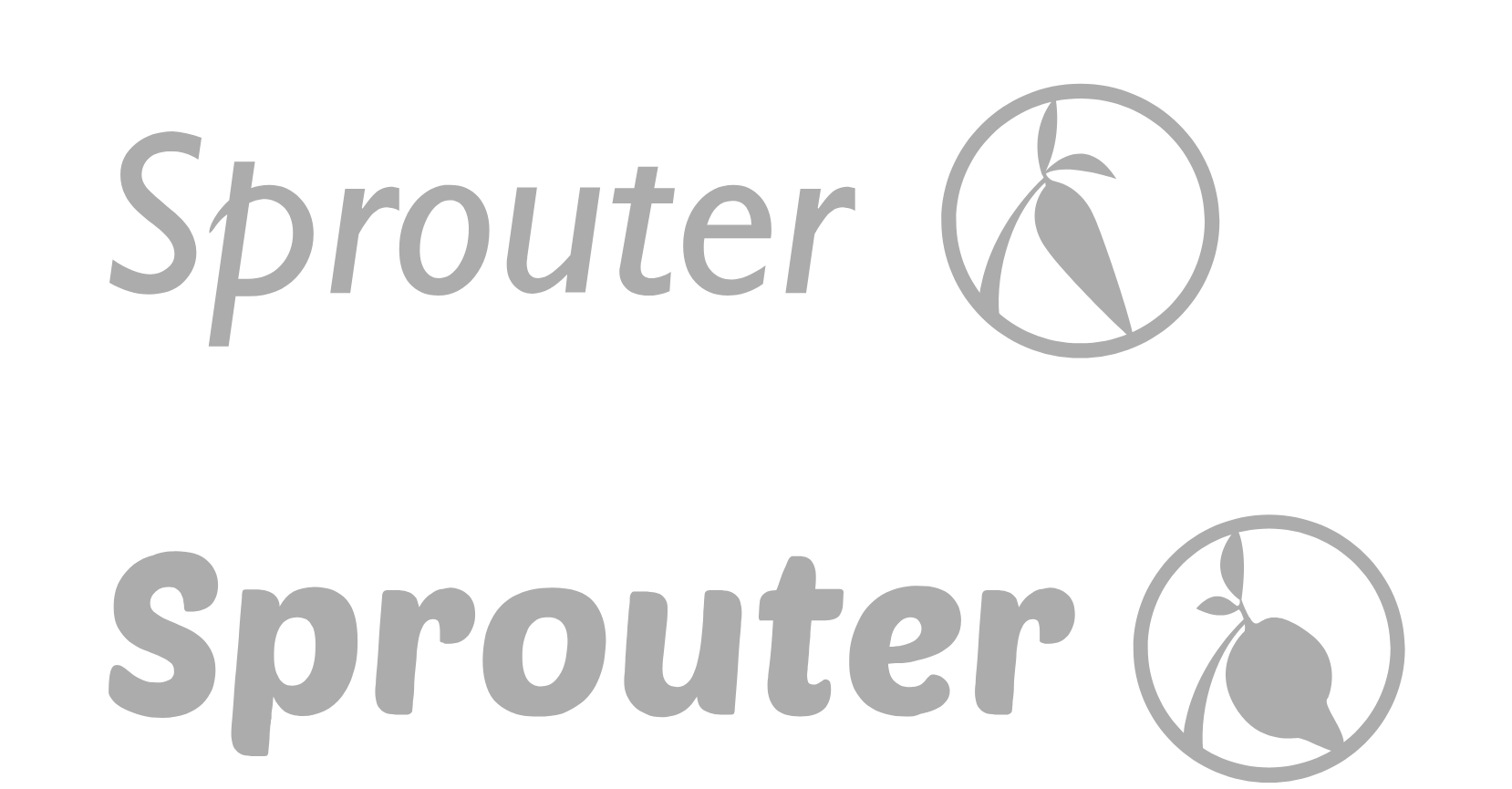
Font & Colors


Gill Sans is a clean san serif font. But, in italics the p has a flourish, which matches the organic shapes of the lemon on the vine. Other letters have slanted terminals which lead the viewer’s eyes to the lemon emblem.
The colors represent everything essential to plants, yellow is sunlight, blue is water, and green represents the plants themselves.
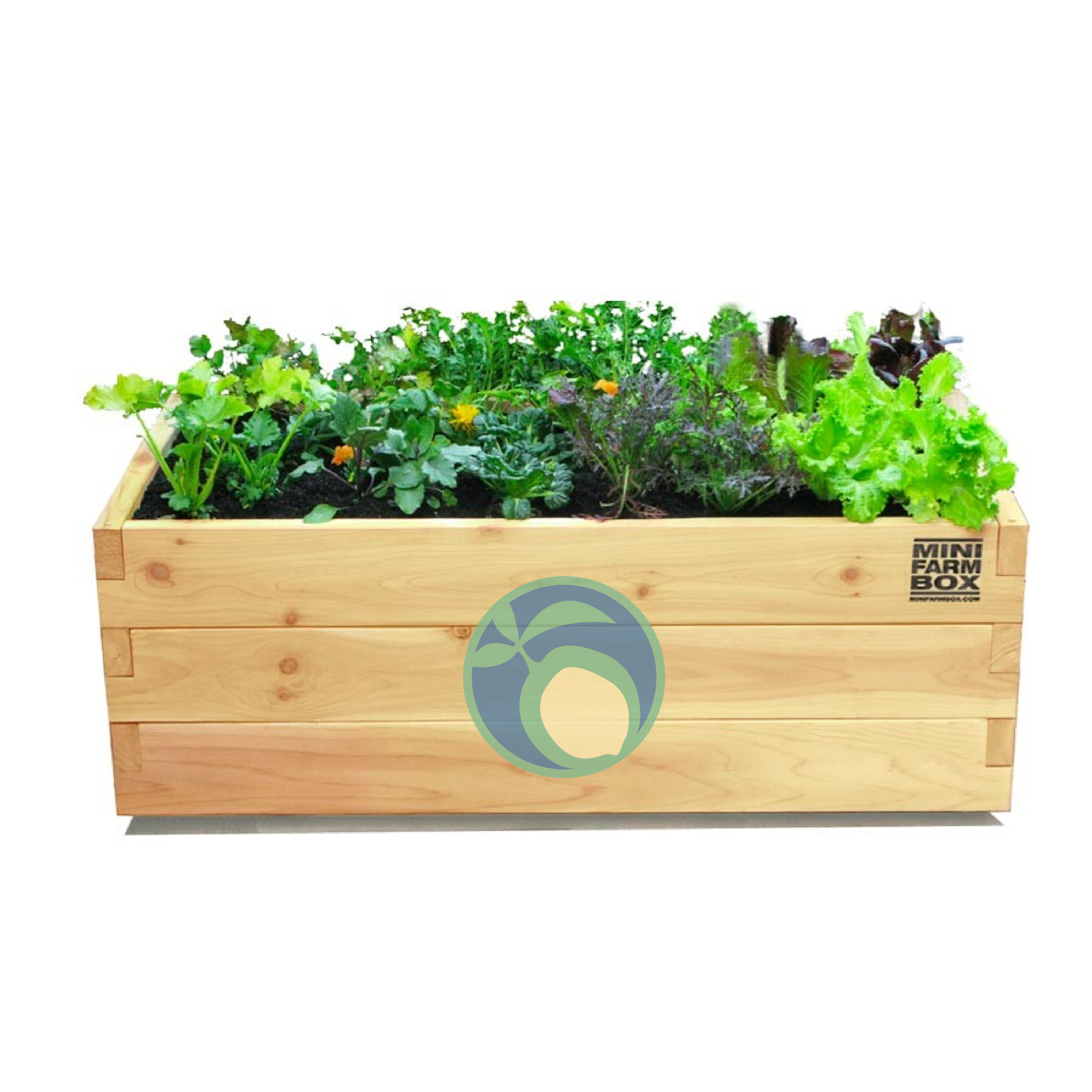
Final Deliverables